Wednesday, April 4, 2012

Let's Try GIMP! Lesson 6: Whoops. The 3 Bears of .GIF Animation

SEIZURE WARNING: THIS POST CONTAINS A FAST, BLINKING .GIF ANIMATION WITH A SPEED OF 10 FRAMES PER SECOND.

This week, I just wanted to do something fun.  Meet Tony, a character from (among other things) the cartoon The Avengers: Earth's Mightiest Heroes:


He's a bit arrogant, but I suppose being a genius alcoholic billionaire philanthropist will do that to a person. His alternate identity doesn't help much, either.
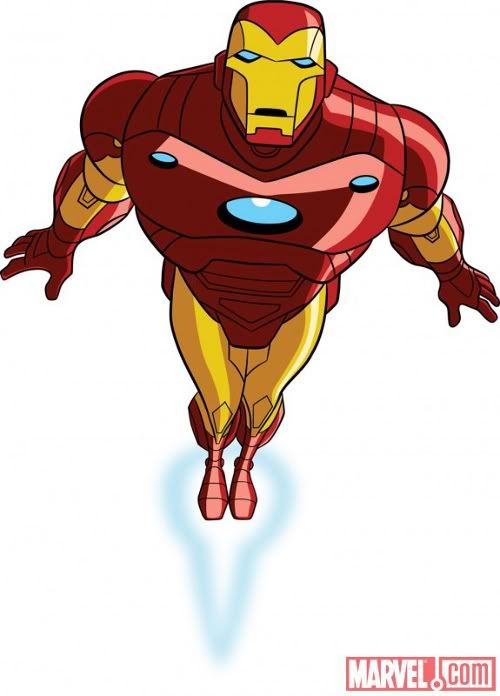
Seriously, I'd be flat-out megalomaniacal if I had access to a rocket suit.
 I want to create an animated icon with this character. We'll skip over the boring parts where I cut Tony's friends, Pepper and Rhodey, out of the image; I've already covered most of the relevant techniques.
Icons are pretty small, so I start by making a 100x100 pixel New Canvas and pasting Tony on top as a new layer.
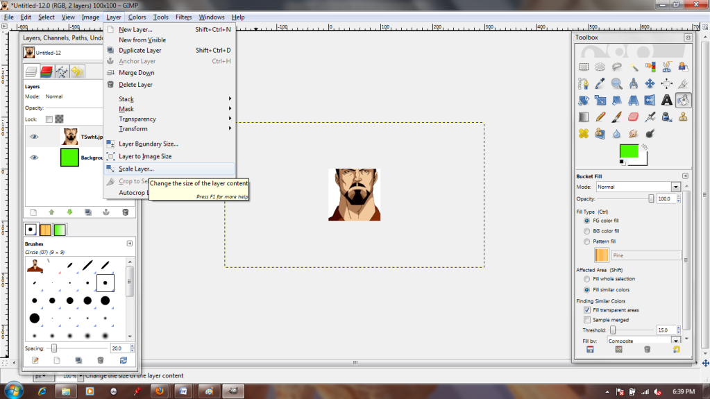

Oof! He looks a bit cramped, doesn't he? The Scale Layer tool will fix that, though.
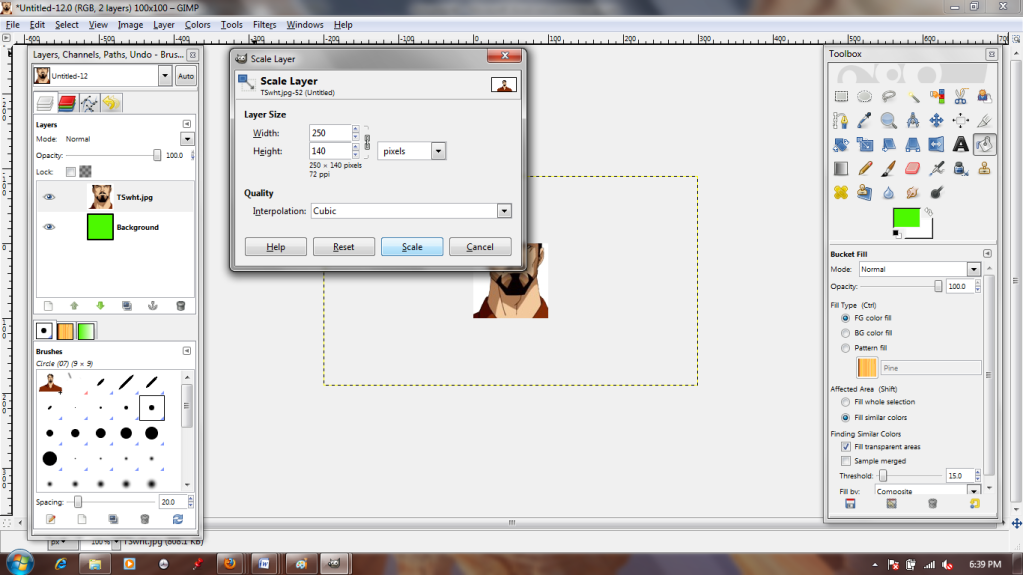

You'll notice that I'm basically just eyeballing how much I shrink the image; I just want it smaller, and I can toggle it up and down with this tool until I get a result I like. The little chain between the two numbers in the dialogue box means they're "linked"; in other words, the X and Y axes remain proportionate. This prevents the image from distorting as it shrinks or grows.
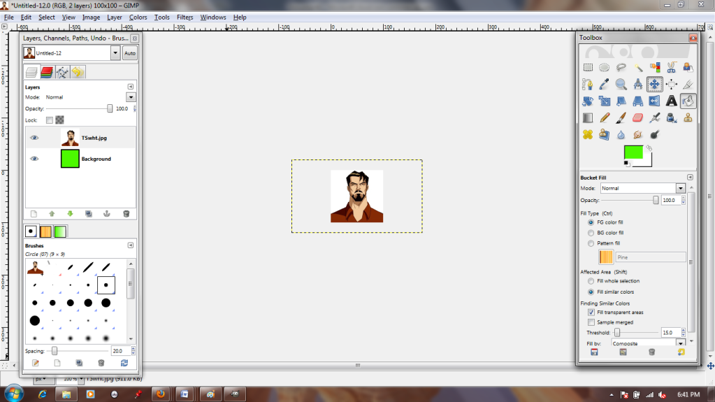
 
He fits pretty nicely now. The Move tool lets me scooch the layer around until I like how he's framed. The parts of the image that hang off the visible canvas are not a problem, so I'm going to ignore them for now.
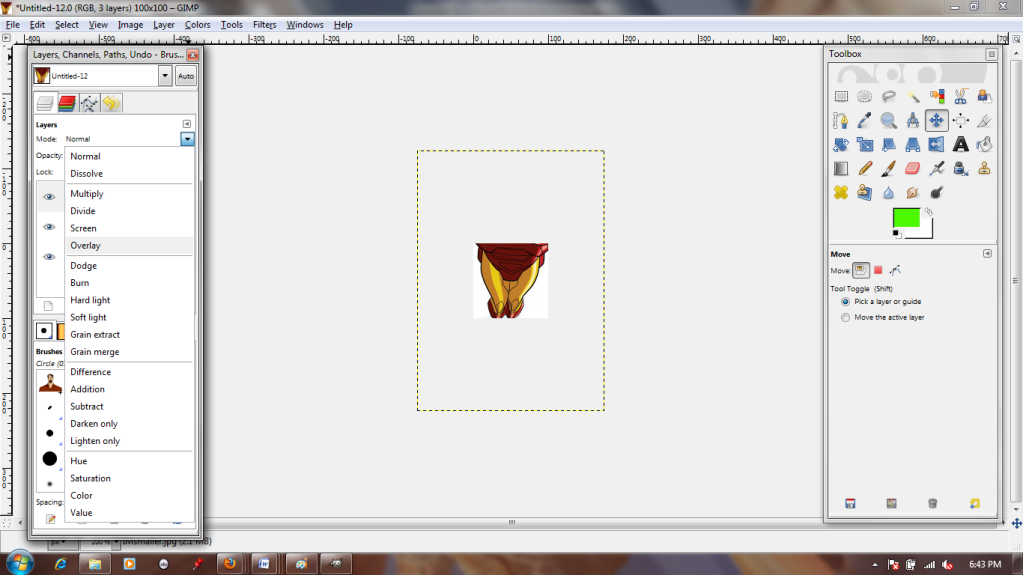
 
Next, I repeat the process by pasting in my image of the Iron Man suit as a new layer. I'm going to have to resize it, but more importantly, I want to position it correctly.
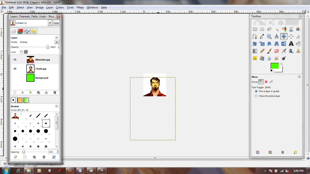


I do this by changing the layer type to "Overlay." This allows me to see the lower layer through the one I'm manipulating. I can just match the mask of the suit up with Tony's face! Afterward, I set it back to "Normal," which returns it to full opacity.
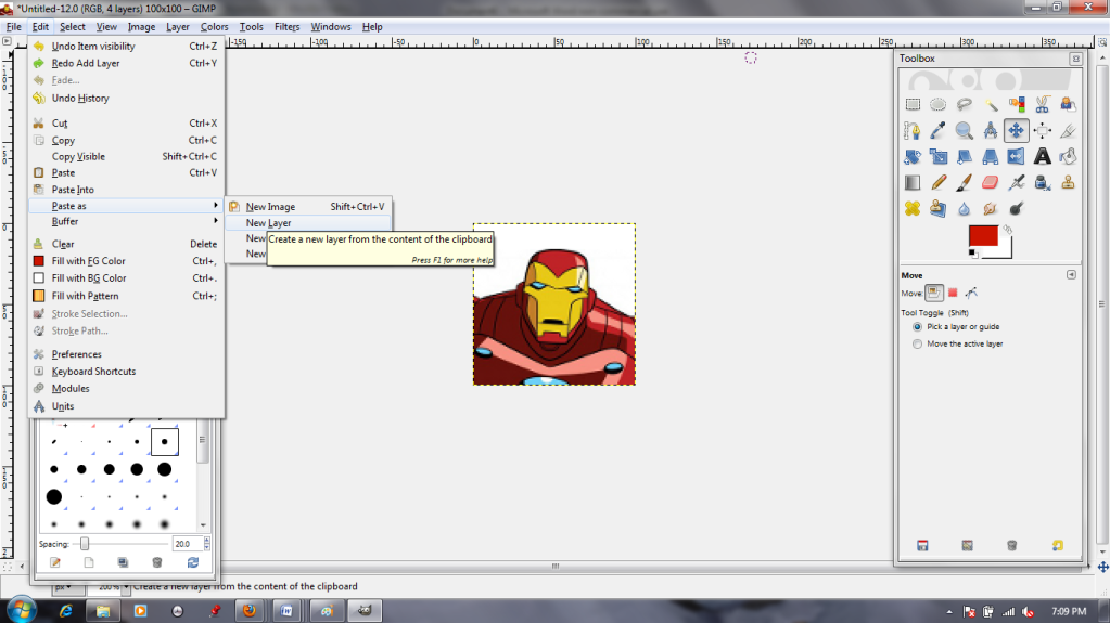
I copy my Tony layer and my Iron man layer so that there are two of each, one on top of the other (4 layers total).


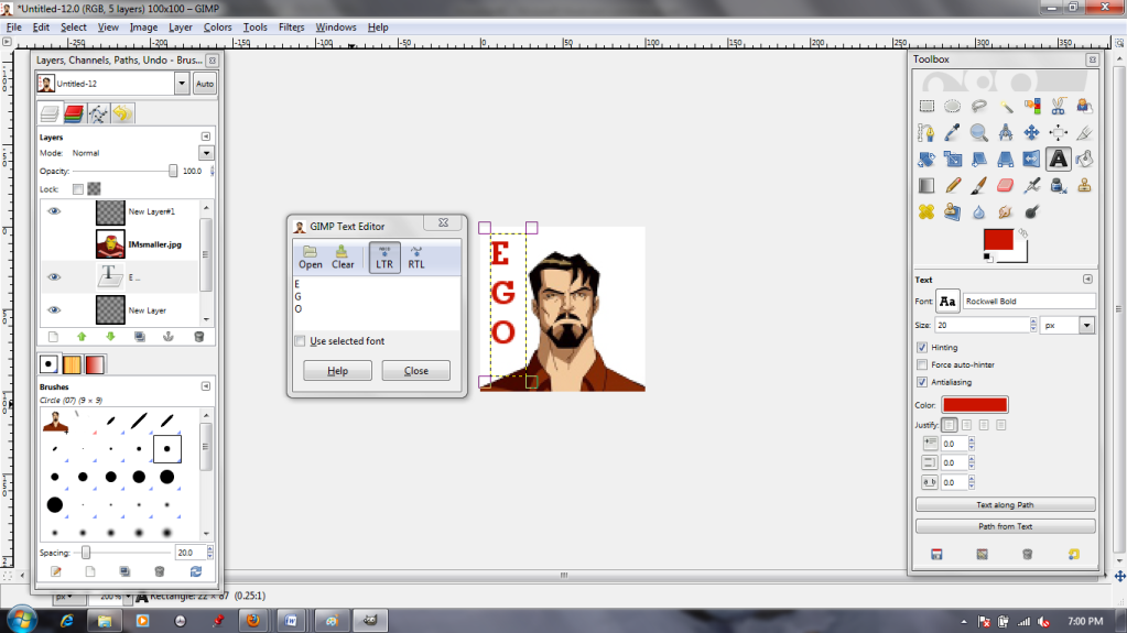
Then I click the eyeball to make Iron Man (men?) invisible. The Text tool lets me type text in as a new layer. I can choose font, color, size, move it around, whatever. After I'm satisfied with my Tony text, I give Iron man a caption as well.


Okay, this is important: You need the text layers to be directly above the image layers to which they belong, because in the next step...
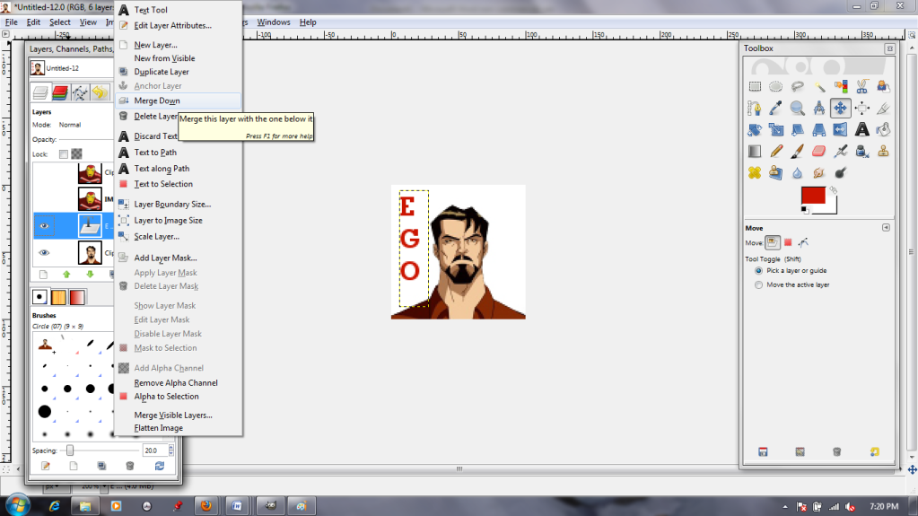

 You select the text layer and use the "Merge Down" command. This makes the text PART OF the image. You don't want it merging into the wrong layer! I do this for both pieces of text. I can't just leave the text as separate layers because I'm making an animation; .GIFs read each layer as a separate frame, so the text and image need to be smooshed together in order to be visible at the same time.
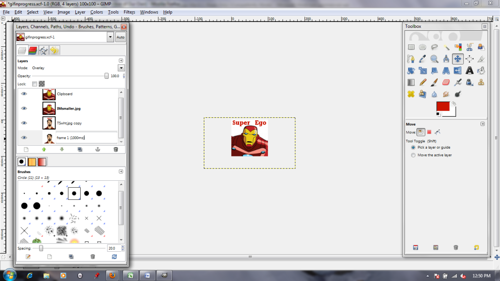

Next, I'm going to begin changing the layers' names. I call the bottom one "frame 1 (1000ms)" because it's the first frame I want to see, and I think I want to see it for about 1000 milliseconds (1 second). When renaming, double-click the name, type the new one in, and then HIT ENTER to make sure it sticks.
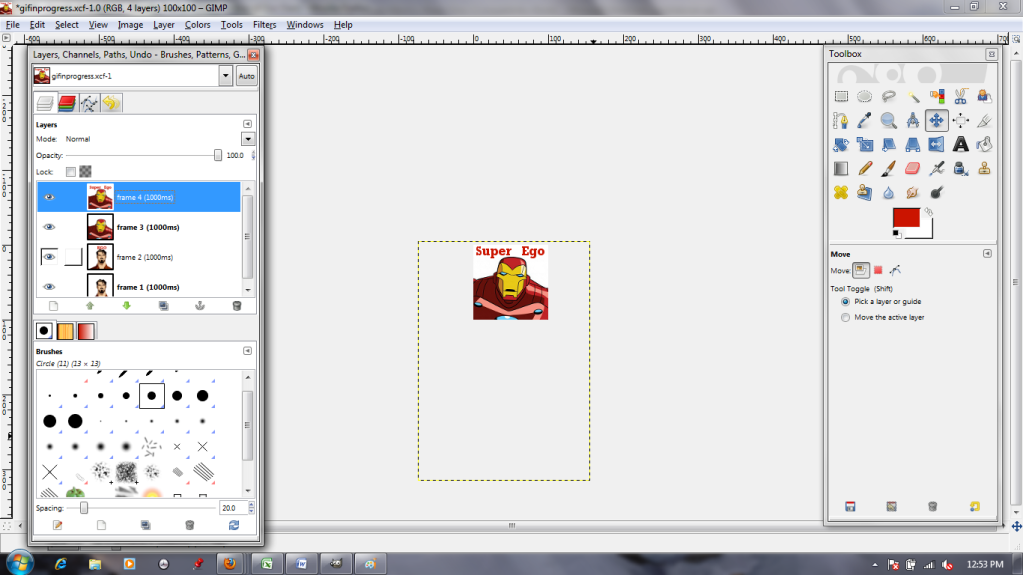

This goes for all four layers.
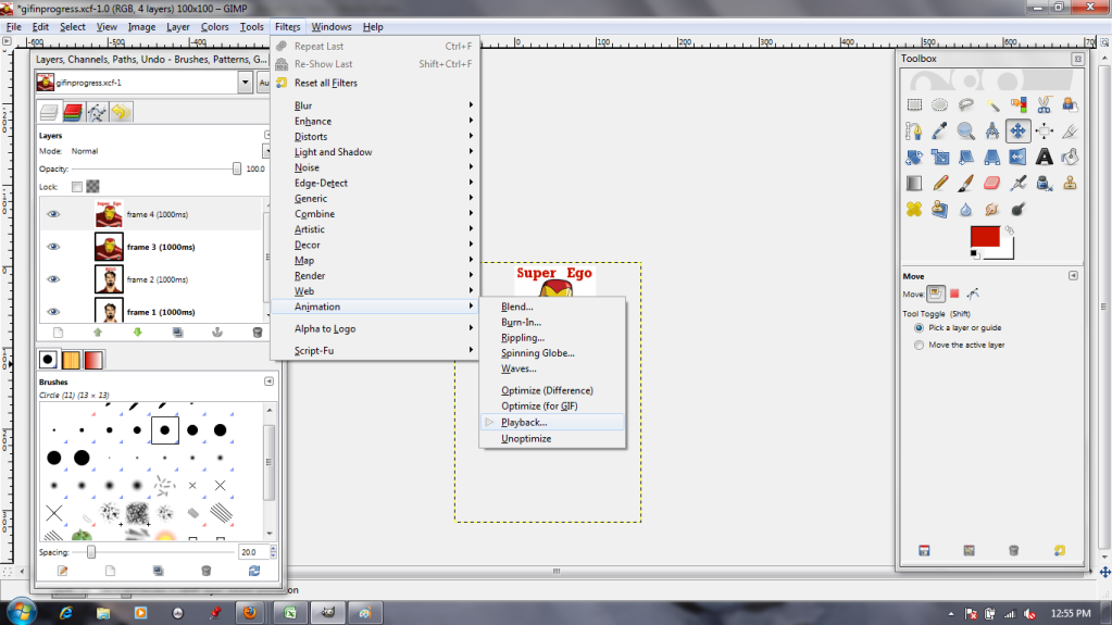

Now I need to test and see if I like how it looks. The "Animation Playback" in the Filters menu lets me do so.
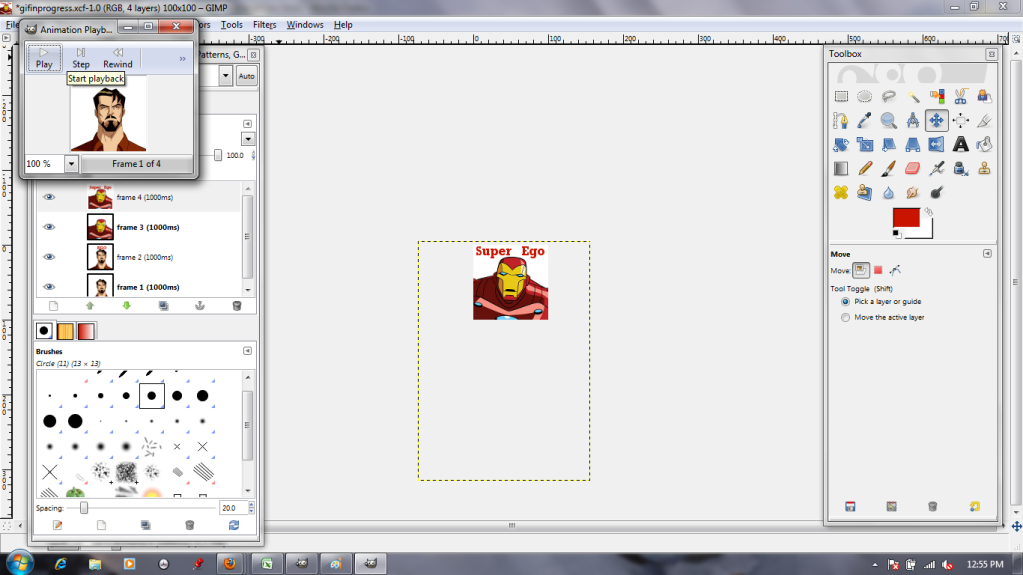
I hit play...

...And don't like it. It's too slow.


Well. I'll just change the layer names to "frame X (100ms)"! That will be faster!
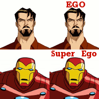
SEIZURE WARNING (BELOW)


SEIZURE WARNING (ABOVE)

Too fast! Too fast!


Finally, I settle on alternating 500ms text-free layers and 1000ms text-added layers.
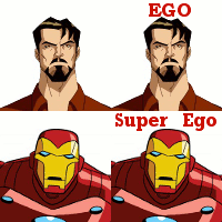

Looking good! (And he knows it, the self-satisfied jerk.) Now, to save it as a .gif.


Name it whatever you want, but change the file extension (top orange box) from GIMP's normal .xcf to .gif.


The next dialogue box will come up with a "Flatten" option autoselected. WE DO NOT WANT THAT, because it smooshes all the layers down into a single static image. Instead, select the "Save as Animation" option.
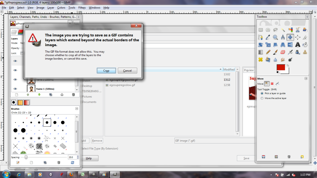


Remember those extra, hanging-off bits of the images? The ones we ignored earlier? This dialogue box is where those get dealt with. By selecting "Crop," we chop off the invisible excess, reducing the images to the canvas size just like that!

And there you have it: an easy four-frame animation.

Sunday, March 11, 2012

Let's Try GIMP! Lesson 5: Paths 1

Paths are capable of a whole lot in GIMP. For now, I'll just be showing you the most basic; creating paths, converting text to a path, and 'stroking' paths to get pattern effects.

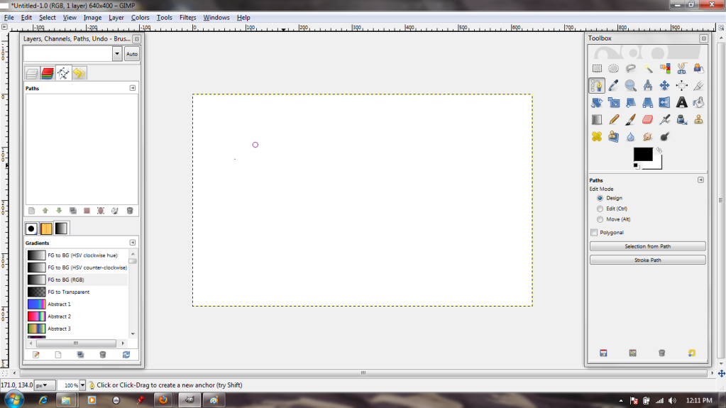
First things first, I need to select the Path tool from the Toolbox. It's the one that features the tip of a fountain pen. When I left-click it on my canvas, a dot appears; this is the first anchor point.

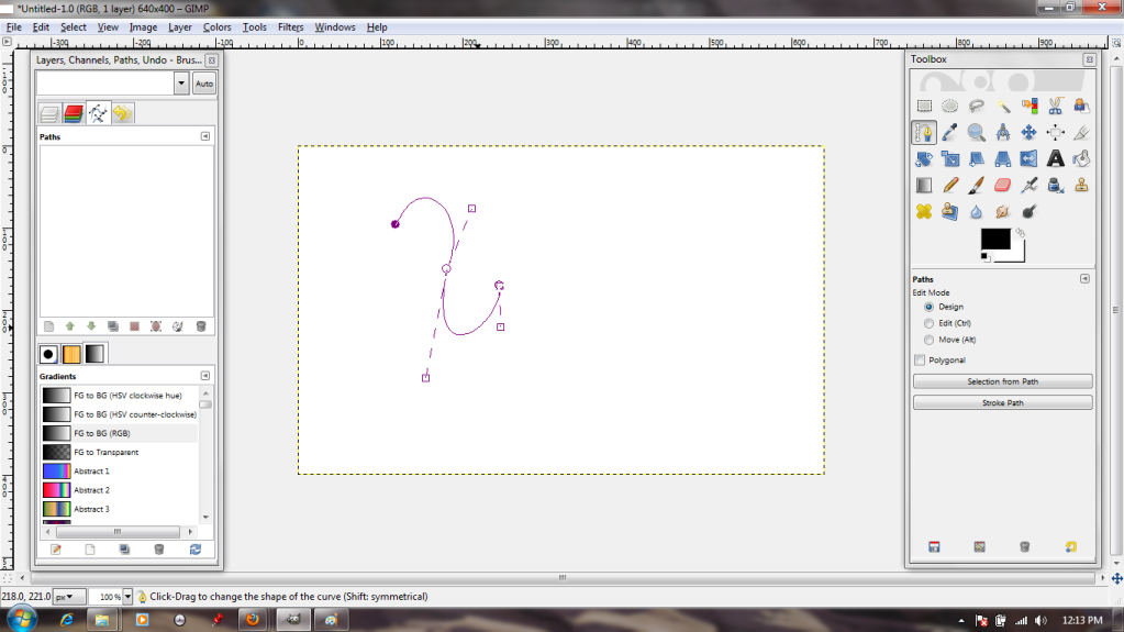
By clicking again and again, I make a path. The active dot--that is, the one I'm manipulating at any given moment--is clear with a purple outline, while the quiescent dots are solid purple.


I can manipulate the lines that comprise the path. Either by grasping them and stretching or by using the 'handles' at the anchors, it's possible to create any curve imaginable.


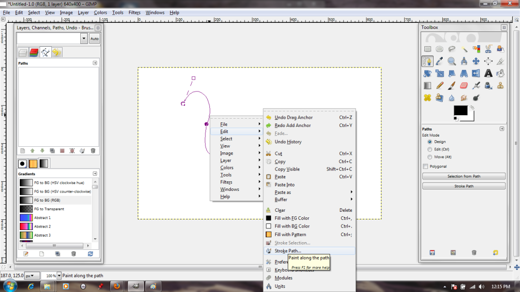
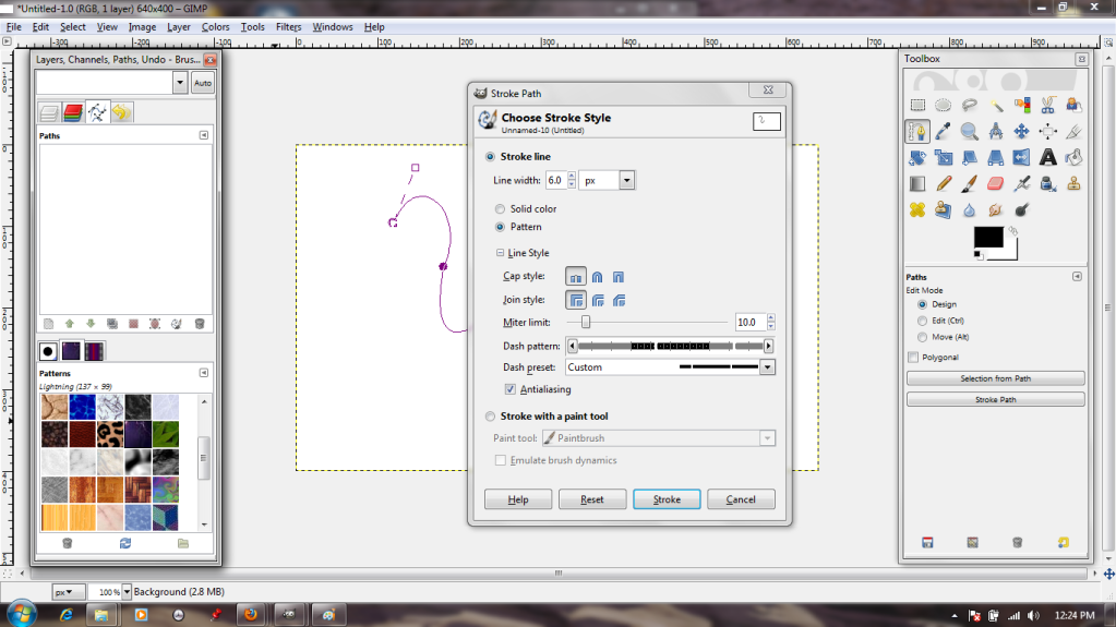
Now, the path is well and good, but I want to add effects to it. We'll do this by "stroking." I access the stroke dialogue through the menu that pops up after I right-click on the image.


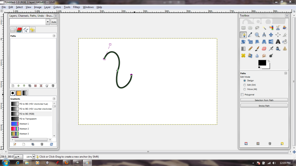
The dialogue is pretty simple; solid or pattern, various paintbrush effects, options to make the resulting line dotted. I'll go with the default, just to see what that gets me.


...A big, thick, plain line in the selected foreground color. Not exactly exciting, so I Undo.


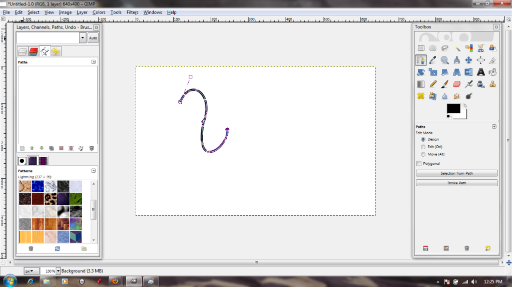
Back in the dialogue box, I choose to stroke it with a pattern; in this case, a pretty blue one. I also choose a frequency for breaks in my line, so that it will be dotted.


 That's a bit more interesting!


 But suppose I want to add that kind of effect to text?
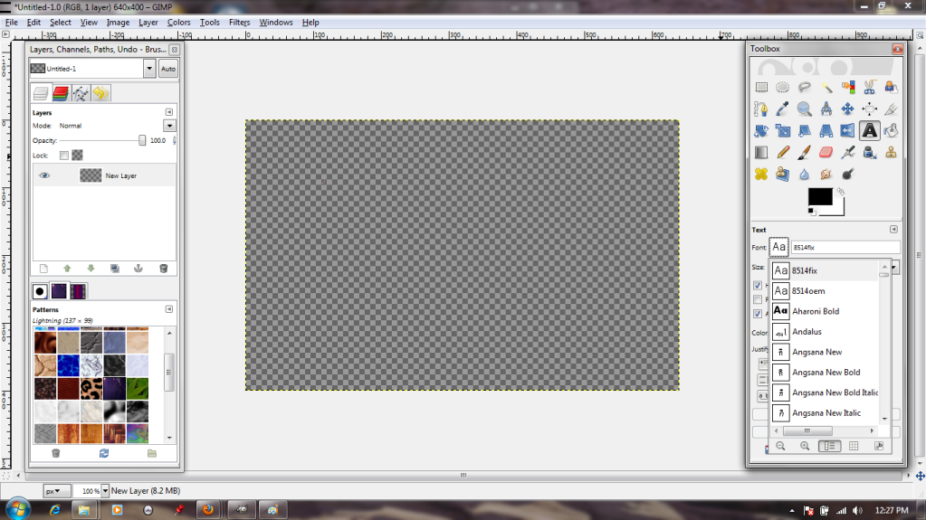
Well, to start with, I will need to choose the Text tool and a font.


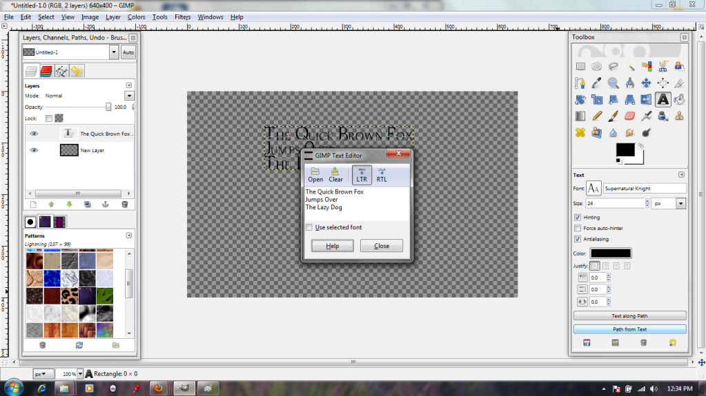
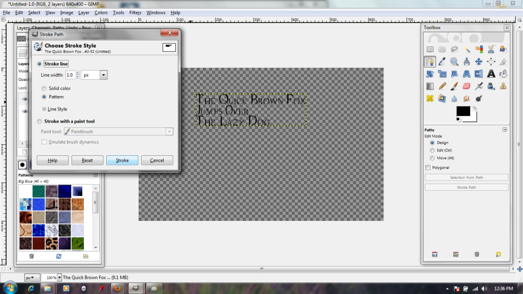
The typing dialogue box is pretty standard, if somewhat lacking in alignment options. Oh well. I put in a bit of filler text anyway, then click on the "Path From Text" button (highlighted in blue) to make the text itself into a shiny new path.


Back in the stroke dialogue, I specify that it should stroke it quite narrowly (1 pixel). This is because the font is quite fine-lined, and it could easily become illegible if it were stroked thickly.


And here we are; pretty, ripply blue text.


There will be more on paths next week!

Friday, March 2, 2012

Let's Try GIMP! Lesson 4: I Use Filters Now. Filters are COOL.

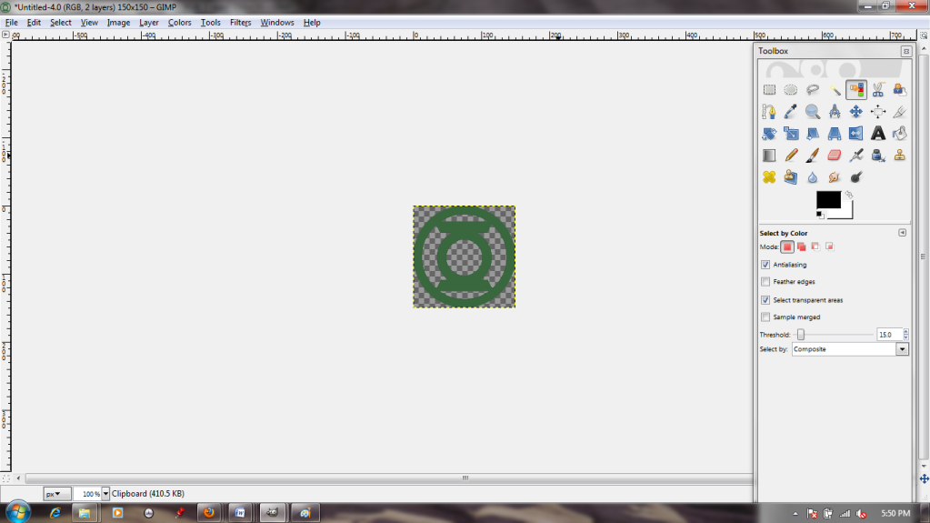
Another day, another insignia. I had to do the same color-select/paste thing with this as I did with the last one; in the interests of saving space, we'll skip right to the point where I paste it in as a new layer in a new file. You know the drill.


Looks a bit...drab, doesn't it? :( Ah, well. This is getting tough. I want to do something really cool, but my ambitions have outpaced my skills. If only there were some sort of tools that automatically create sophisticated effects...


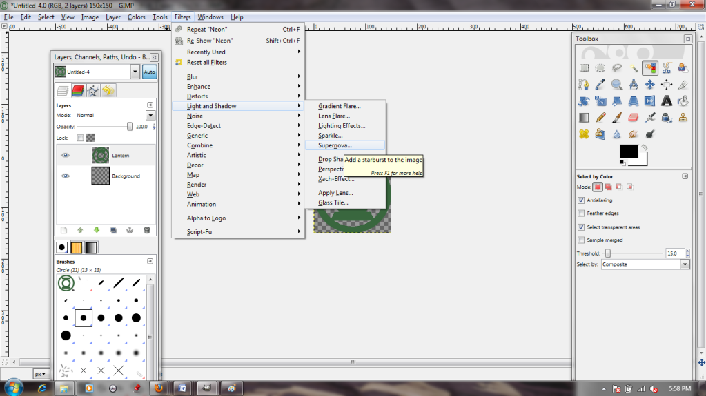
Ooh, filters! "Supernova" sounds fancy!


Ew. Well, that's...less than ideal. It would probably be pretty useful if I wanted to make something look shiny, though. Good thing the preview window lets me have a sneak peek! I'm just going to hit cancel right now, though. I mean, it could be a lot worse; I could have...


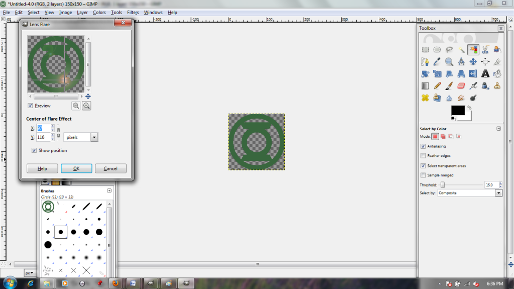
Lens flare!? No, I don't want this to look like an Abrams movie (although the dialogue does allow me to move the "light" around with my cursor, which is interesting). Cancel!


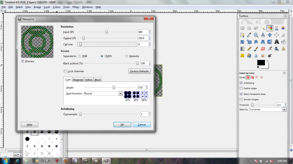
Maybe I should carry on with my comic book theme. The Newsprint filter looks interesting, and the sliders let me adjust the dot size up and down, but it's a bit gritty for my taste.


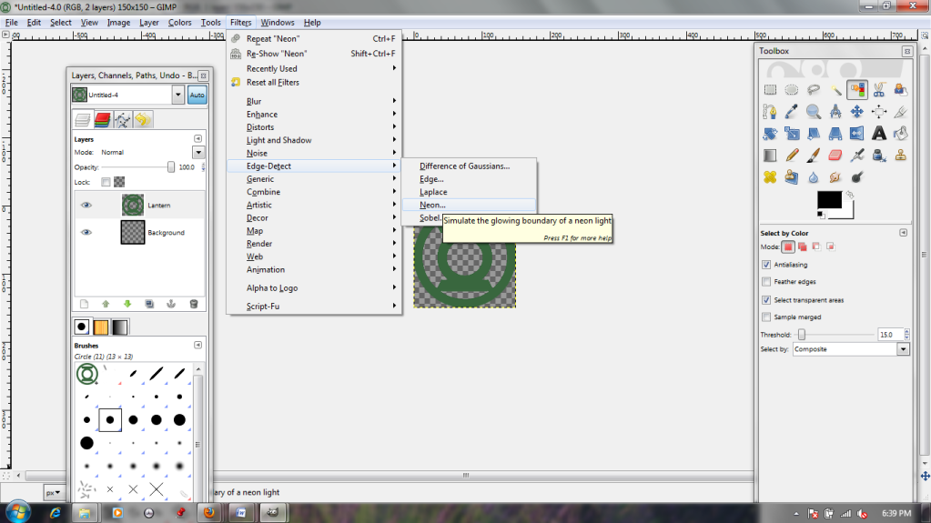
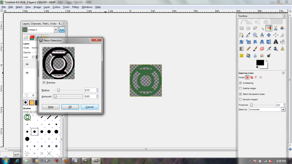
"Edge Detect" sounds as though it sharpens images, and the "Neon" option is interesting. The shiny edge makes it look quite 3-D. It's a bit dark, though, regardless of the name.


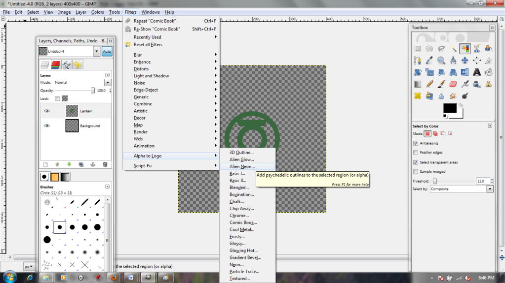
The most interesting options by far are in the "Alpha to Logo" section; I think I'll continue with my neon theme by choosing "Alien Neon." It lets me choose a color and a number of bands.


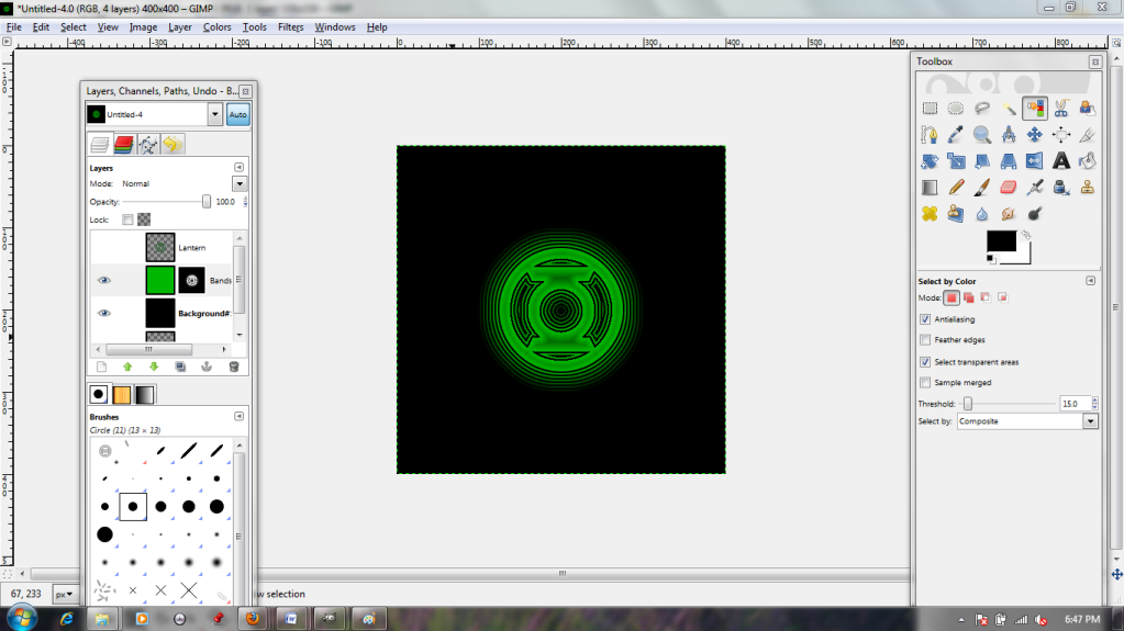
Wow! This filter actually rendered a new background layer in black AND a pre-masked layer in bright green! Best of all, my original is still there (invisible up top) in case I should change my mind.


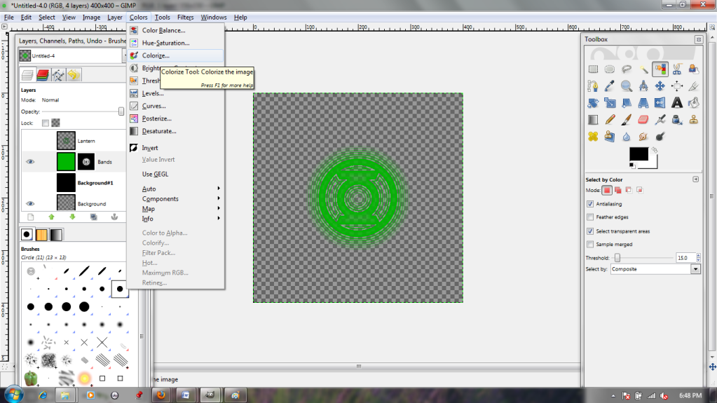
But on second thought, I don't like the bright green. "Colorize" will fix that.


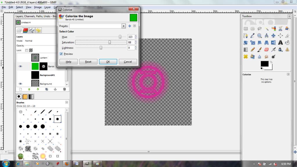
The sliders in the dialogue box let me toy with the layer's color. I can go from pink...


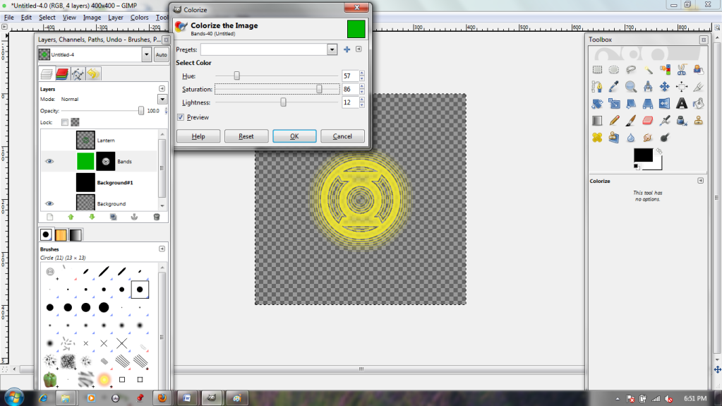
...to yellow in just a few clicks!

Filters can be really helpful for getting an effect that you can't do by yourself.

Saturday, February 25, 2012

Let's Try GIMP! Lesson 3: Opening AI Files, Copy/Pasting as Layer, Clone Tool, and Warping Images

Oof. I had to work on Friday night, and so this blog update is late. To make up for it, I've gone extra-long and tried out several tools and techniques.

Because last week's escapade with Iron Man went so well, I've decided I'd like to mess with Captain America next. I'm going to be adding a new insignia to him. I found a lovely vector graphic made by someone online, and it is exactly what I need.


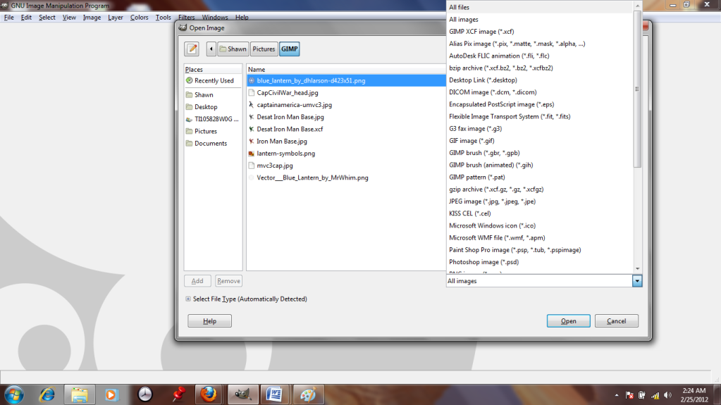
Unfortunately, they made it in Adobe Illustrator, and GIMP doesn't like .ai files. I can't even see it in the "open" dialogue. :-(
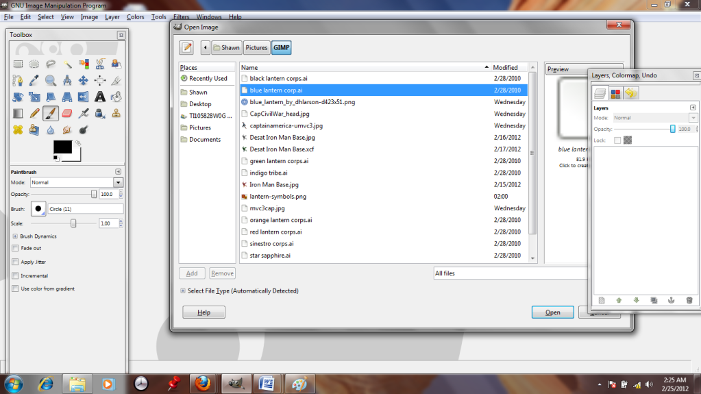
But if I change the setting from "All Images" to "All Files"...


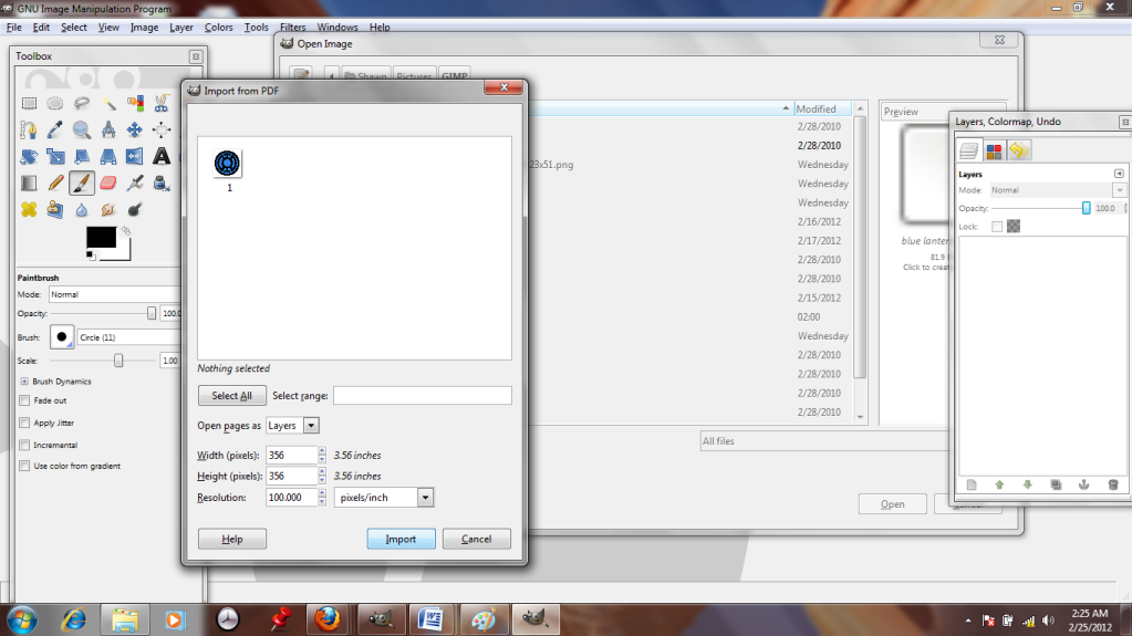
It suddenly appears. GIMP can read it like a .pdf, as long as I convert it. Hooray!


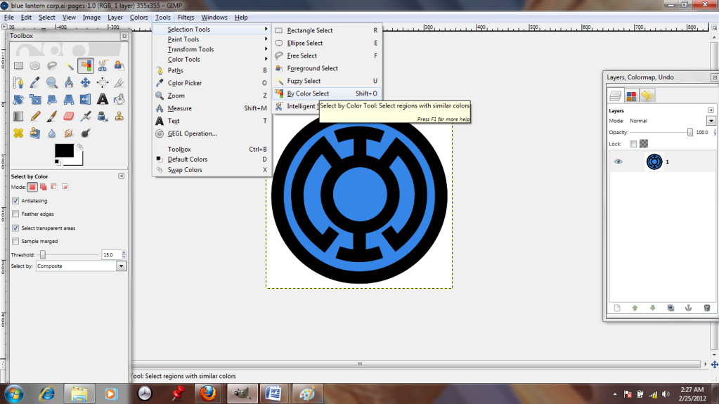
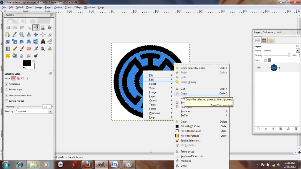
It's a nice image, but I don't want the whole thing, just the black parts, so I'm going to use the "color select" tool to pick those out. Just click it, then click the black regions.


The selected regions are surrounded by white dotted lines. I right-click and copy the parts I want; they're now stored in my clipboard.


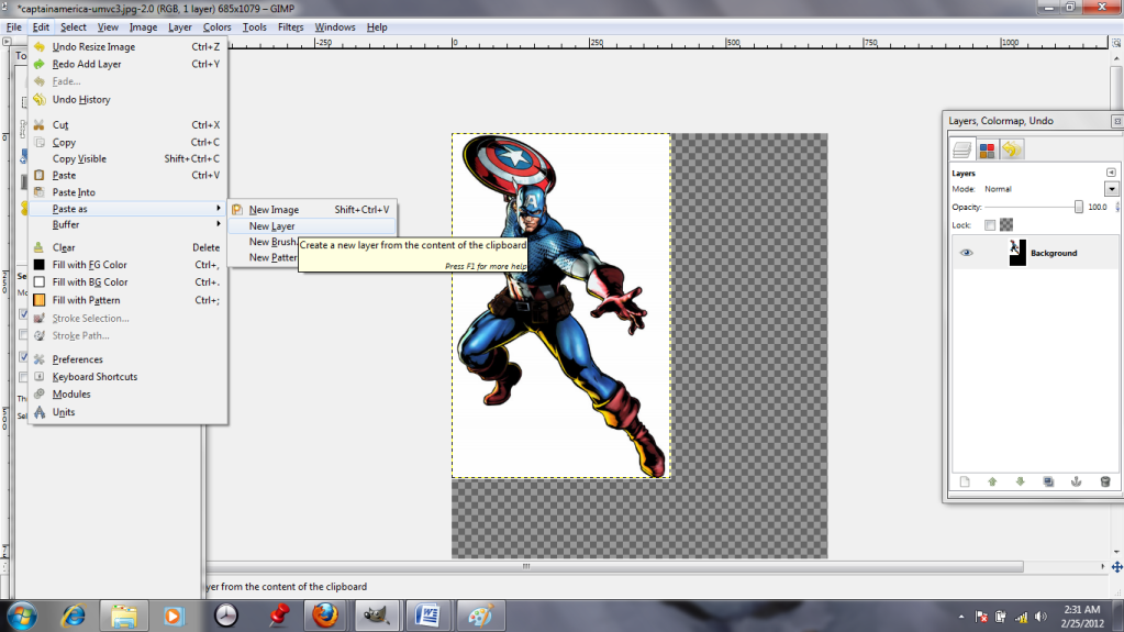
Captain America apparently took posing lessons from his good friend Iron Man, I notice! I'm going to paste the black outline in as a New Layer.
Pasting it as a new layer ensures that I can do whatever I want to the insignia without harming Cap, who is my background layer.


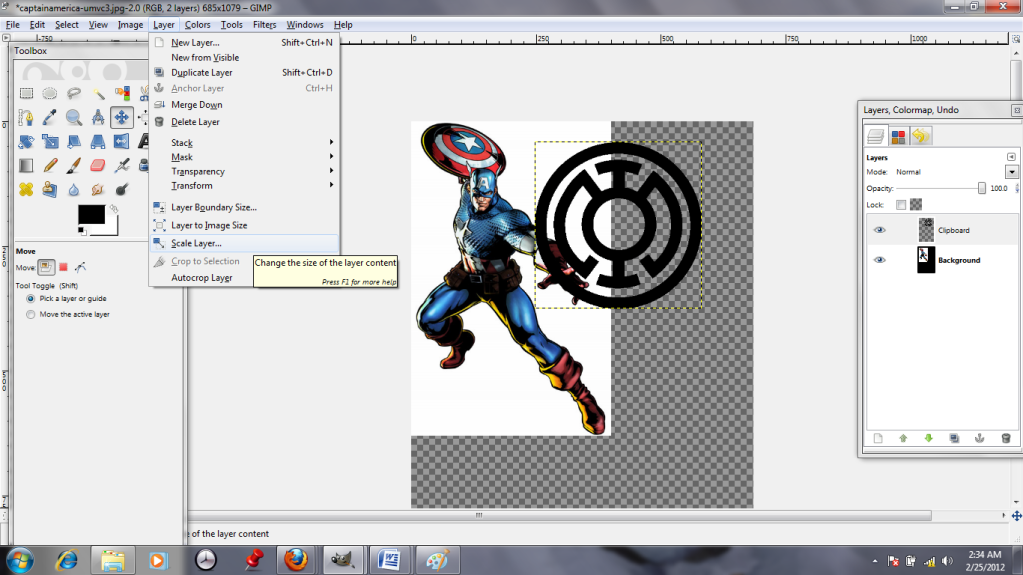
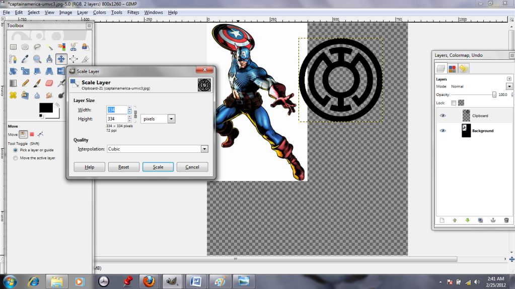
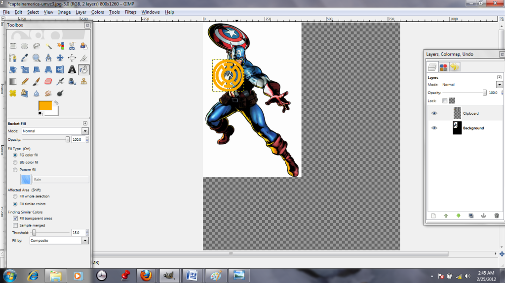
 It's pasted in, all right, but it's enormous! The "Scale Layer" tool lets me toggle the size up and down...


 ...I just play with it until it looks about right. (The insignia will also be orange from now on, for the sake of visibility.)


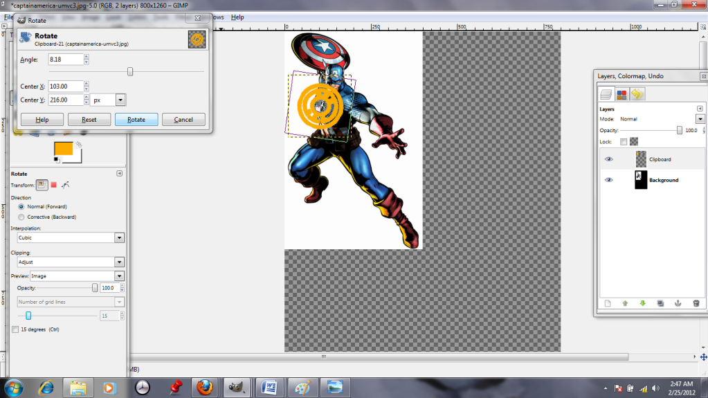
The "Rotate" tool, 3 down on the far left of the toolbox, allows me to twist the layer like I'm spinning a record. This is helpful, because Cap's chest is angled. I use his star as a guide to eyeball the appropriate tilt. Then I scoot that layer over and select the background; I need to do some cloning. Will humanity never learn from Reed Richards' mistakes!? (No, not that kind of cloning. I promise, no robot Thors.)


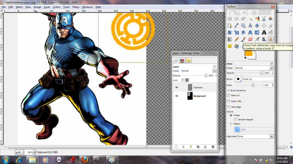
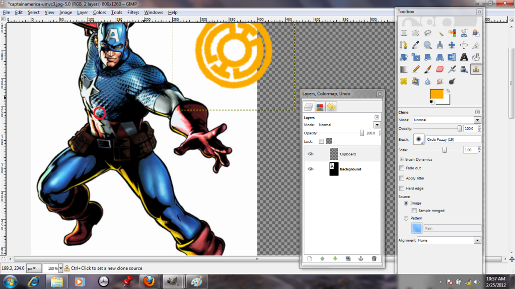
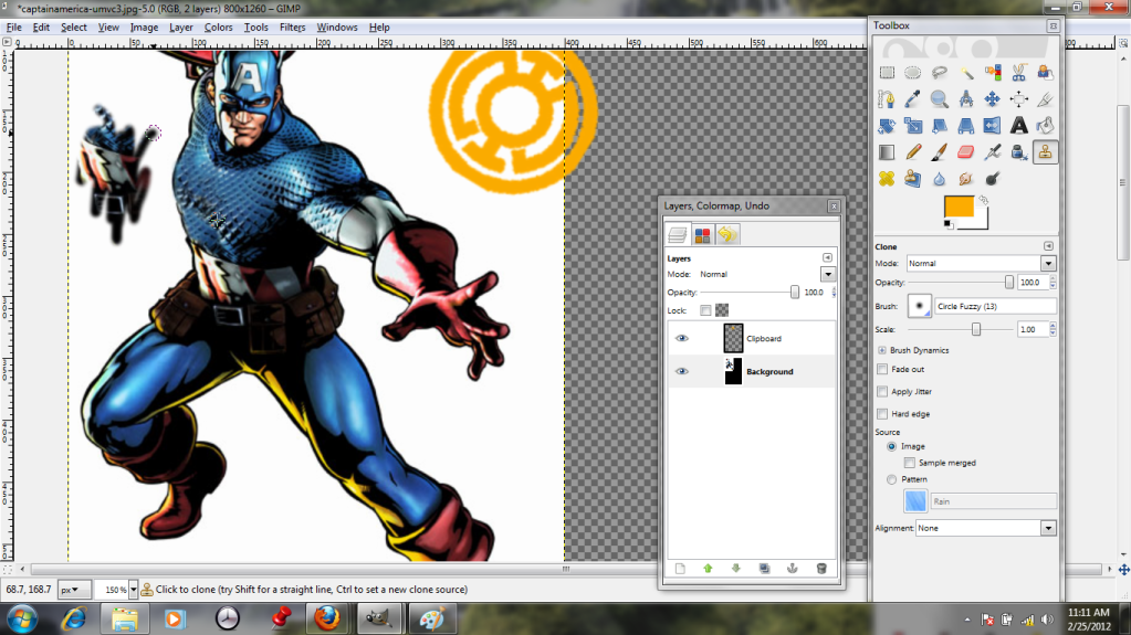
The "Clone" tool is pretty neat. It allows me to select one area (seen here with a red circle added,) and use that as a paintbrush. This way, I can hide Cap's star with cloned chain mail, as long as I am careful to pluck bits from regions that will reasonably match the light and shadow.


Here, we have his chest pretty much done; I've also added a scribble to dramatize what "Clone" really does.


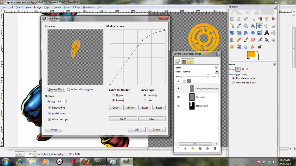
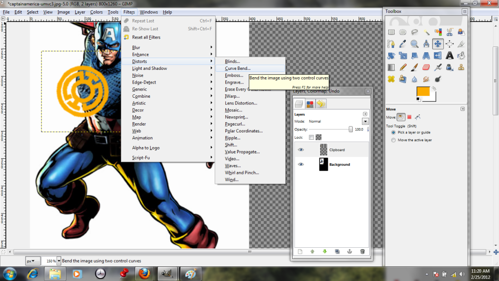
Unfortunately, tilting the insignia wasn't really enough to make it look like it conforms to the shape of his chest. It needs to curve and bend. Shockingly, the best tool for the job is the "Curve Bend" tool!


By playing with the curve in this dialogue, I can stretch and warp the layer like taffy until I get the shape I want. The preview allows me to see what I'm doing, and hopefully to avoid messing it up too much. I've also clicked the option to work with a copy, which means my original layer remains untouched.


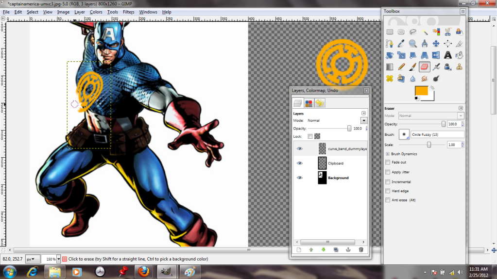
Et voila-- it looks more three-dimensional. I cheat and erase the bits that hang off his body, because "Curve Bend" can't extrapolate that there's a guy there and hide the bits that would be covered.


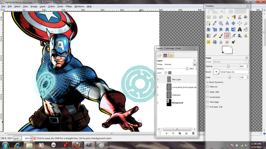
This is my correctly-colored version, with a bit of glow painted on to another new layer (the better to take it off later!)

Naturally, I save this as a GIMP file and exit.