Paths are capable of a whole lot in GIMP. For now, I'll just be showing you the most basic; creating paths, converting text to a path, and 'stroking' paths to get pattern effects.
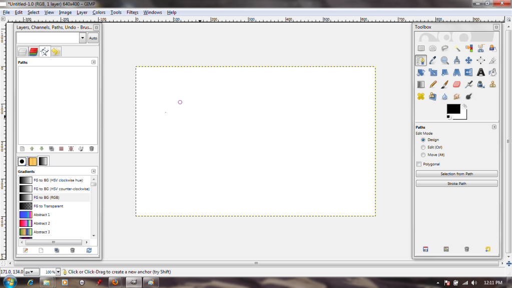
First things first, I need to select the Path tool from the Toolbox. It's the one that features the tip of a fountain pen. When I left-click it on my canvas, a dot appears; this is the first anchor point.
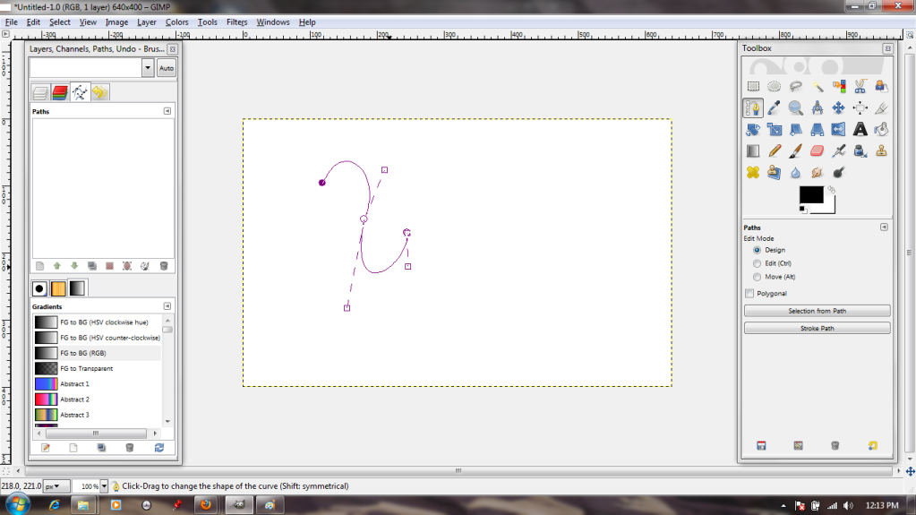
By clicking again and again, I make a path. The active dot--that is, the one I'm manipulating at any given moment--is clear with a purple outline, while the quiescent dots are solid purple.
I can manipulate the lines that comprise the path. Either by grasping them and stretching or by using the 'handles' at the anchors, it's possible to create any curve imaginable.
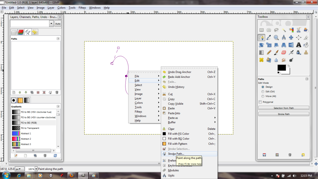
Now, the path is well and good, but I want to add effects to it. We'll do this by "stroking." I access the stroke dialogue through the menu that pops up after I right-click on the image.
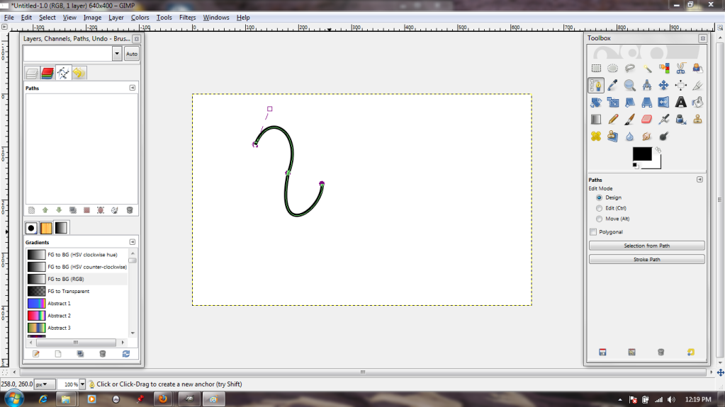
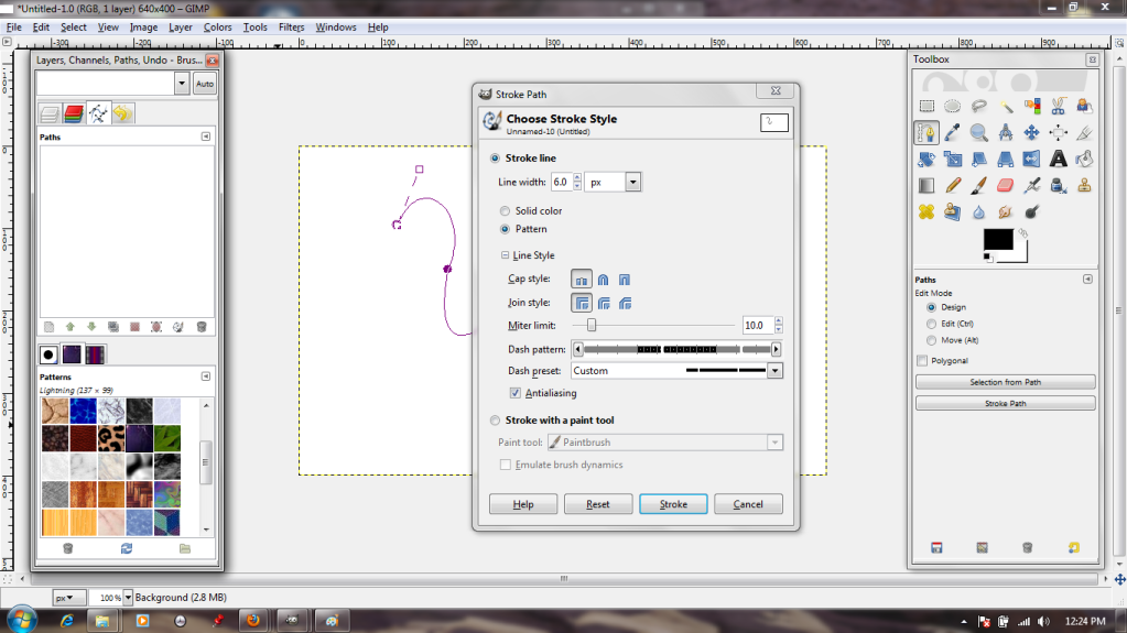
The dialogue is pretty simple; solid or pattern, various paintbrush effects, options to make the resulting line dotted. I'll go with the default, just to see what that gets me.
...A big, thick, plain line in the selected foreground color. Not exactly exciting, so I Undo.
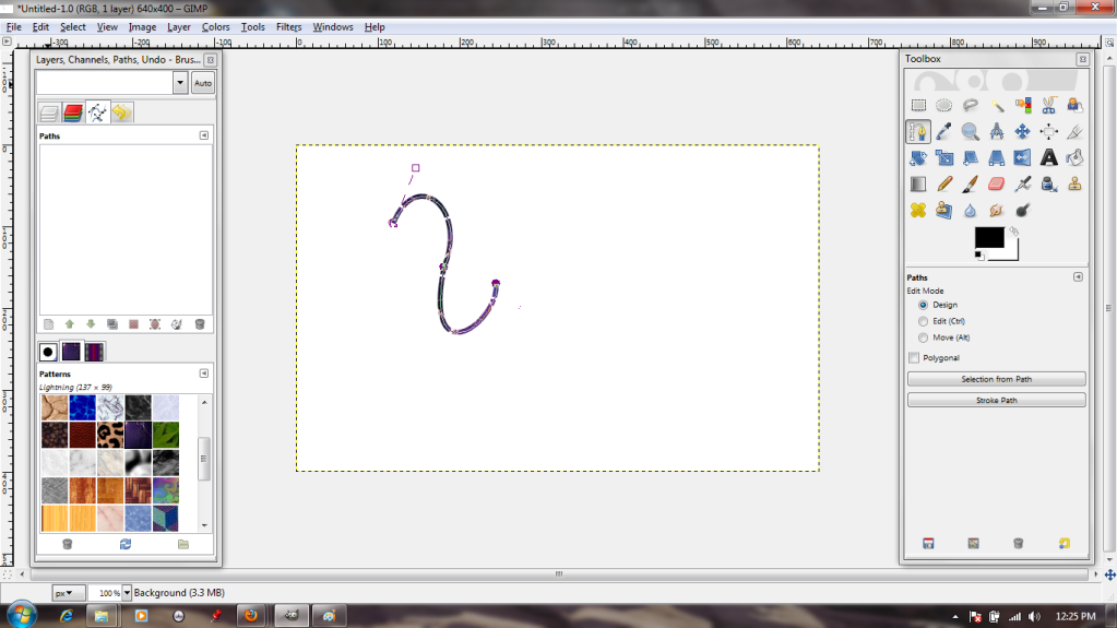
Back in the dialogue box, I choose to stroke it with a pattern; in this case, a pretty blue one. I also choose a frequency for breaks in my line, so that it will be dotted.
That's a bit more interesting!
But suppose I want to add that kind of effect to text?
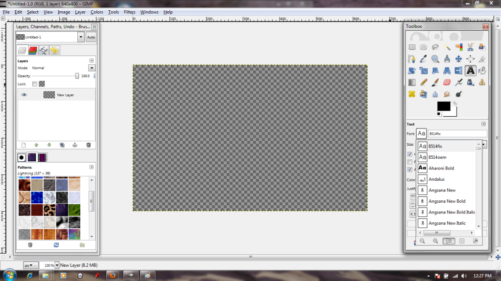
Well, to start with, I will need to choose the Text tool and a font.
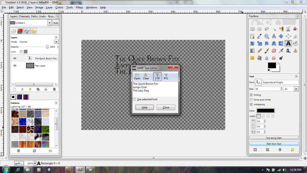
The typing dialogue box is pretty standard, if somewhat lacking in alignment options. Oh well. I put in a bit of filler text anyway, then click on the "Path From Text" button (highlighted in blue) to make the text itself into a shiny new path.
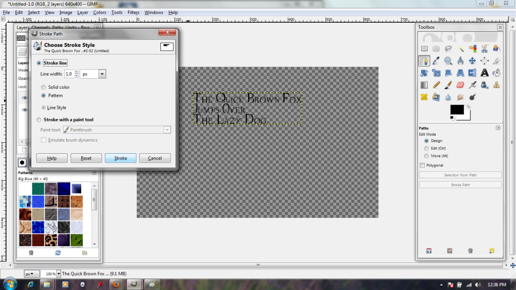
Back in the stroke dialogue, I specify that it should stroke it quite narrowly (1 pixel). This is because the font is quite fine-lined, and it could easily become illegible if it were stroked thickly.
And here we are; pretty, ripply blue text.
There will be more on paths next week!



No comments:
Post a Comment