Wednesday, May 16, 2012

Let's Try GIMP! Lesson 10: Making Smoke without Fire

I've done a lot with altering existing images, but I haven't really created any from scratch. That's largely because I am hamfisted and couldn't foreshorten if my life depended on it, but rest assured: there's one thing that even people as artistically-deficient as myself can make.

That thing is smoke. Pretty, wispy, see-through smoke.

Really!


We begin with a transparent layer. Using the Paintbrush tool, select the largest round brush (19) and a nice medium-grey.


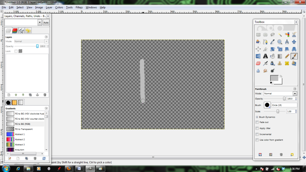
Next, draw a straight-ish line. Luck for me, it needn't be perfect.


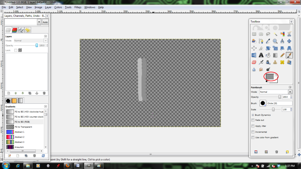
Give it a sibling in a slightly darker shade of grey.


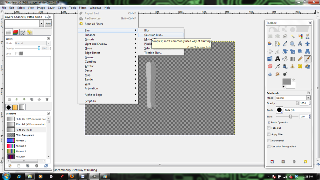
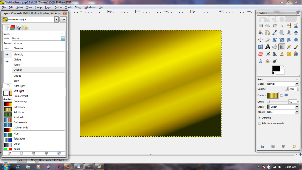
The Gaussian Blur function lives in the Filters menu.


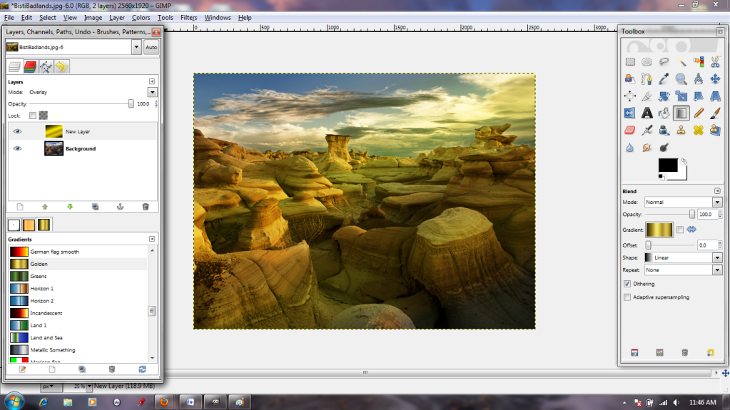
By toggling the degree of blur to 35.o, we ensure that it turns really, really fuzzy. (I've added a separate white layer to the background for easy visibility; it has no bearing on the tutorial.)


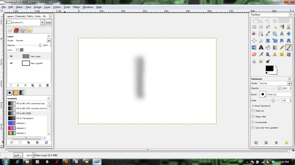
Fuzzy, but not really smokey.


The IWarp filter will let us stretch the image.


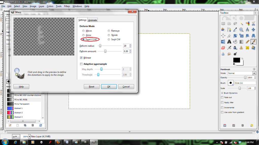
The Swirl CCW option twists the image counter-clockwise around the point at which you click. Above, it's been applied three times.


Next, the Move option lets us grab and shift the pixels as though they were printed on a stretchy sheet. Click with the left mouse button, hold it down, and drag upward and outward. Try it a few times, and we get a nice twisted columnar shape.


Ta-daa!


Here it is on a black backdrop.


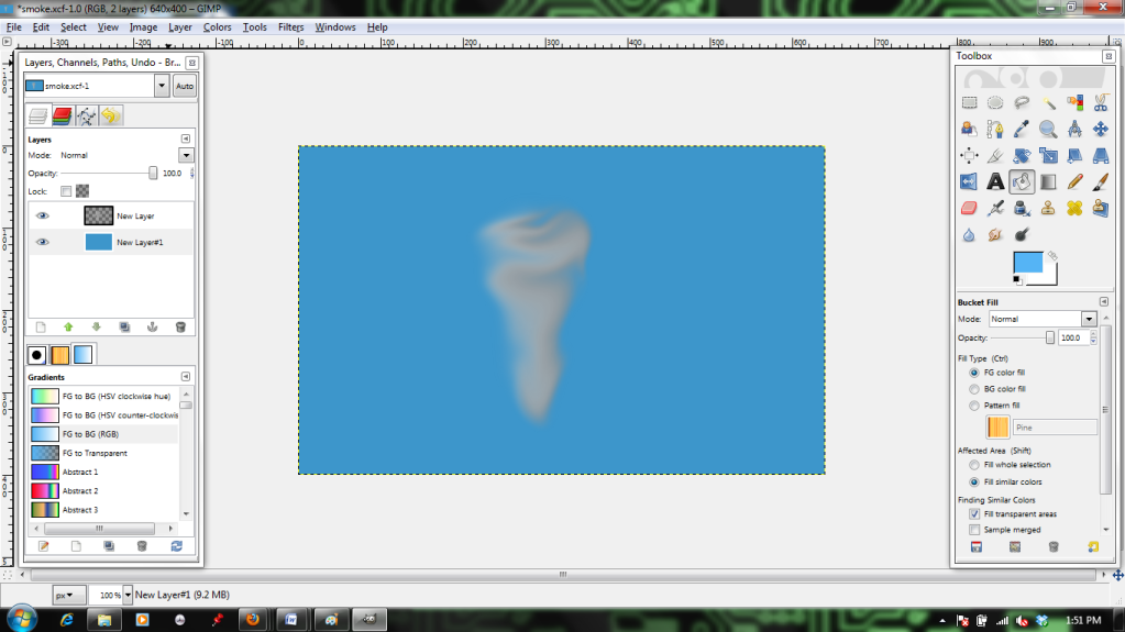
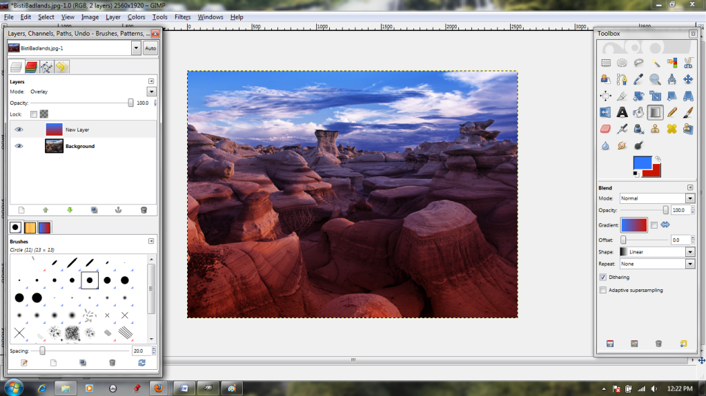
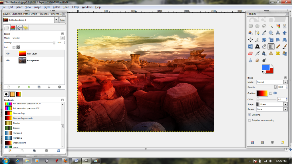
On the blue, the color variations that result from the two shades of grey are most visible. (You could do it with only one, but it would be less detailed.)

Let's Try GIMP! Lesson 9: Gradients, or Cheating at Photos

Beautiful landscape photos: who doesn't love them? Unfortunately, they sometimes don't quiiiiite fit our photo-manipulating needs.

For example, I've found a lovely photo of some rock formations in New Mexico, but it's just...very blue. Terribly, terribly blue. I would prefer reddish, and to heck with realism.


So, not unlike a mad scientist, I set out to remake nature to my own specifications. The first step is (you guessed it!) creating a new layer.


I make it the same size as the photo, and transparent.


Next, I select the Gradient tool (Toolbox, fourth row down, third from the right). The control for the tool is a "stretchy" line; I left-click at the top of the screen, then again at the bottom. The line follows straight along. The second click turns on the gradient.


I know, I know--not helpful at all. But look what happens next:


I switch the layer mode to Overlay.


This makes it behave like a piece of transparent cellophane, with the colors printed on. Much better, but not the right color. I can choose another from the gradients in the Layers box.


Gradients appear differently depending on the way you move the mouse when applying them. Note that in this case, the start point is at the top of the image, and the end point at the bottom.


The line in this is simulated for easy understanding, but I've tried to make what happens obvious in this image: the part of the gradient displayed the farthest to the left is associated with the Start point (red stars & arrows), while the portion displayed to the right is associated with the End (green stars & arrows). The gradient displays perpendicular--NOT PARALLEL--to the stretchy line.


This is the same gradient, applied with a bottom-to-top movement.


Left-to right. You get the idea.


There are many premade gradients, but it's also possible to make your own; simply select the gradient called "foreground to background" and a pair of colors. In this case, I've chosen red and blue.


Apply top-to bottom, and I get this. Easy, right? Many of the premade gradients have more than two colors, and I eventually settled on one called "German Flag Smooth," because it reminded me of a desert dawn and looked a bit closer to natural:


Let's Try GIMP! Lesson 8: Scaling & Layer Order

Now, one thing that is easily overlooked but VERY important is layer order--that is, the top-to-bottom "locations" of all of the layers, which affects literally everything about an image. In GIMP, the order is displayed over in the "Layers, Channels, Paths & Undo" box.

I'm going to mess with the layer order to make it appear as though there is an image on Kingpin's shirt.


In this case, you can see that the layers displayed are, top-to-bottom: Pants, Orange Symbol, and Kingpin himself.
Orange Symbol is looking a tad big for my purposes, so I'm going to scale it down. This step has been addressed previously, in Lesson 6.


Next, I create a new layer above Kingpin.


Because it's above him, I can Paint it orange with the Paintbrush tool, and it goes on over him. However, because it's a new layer, it doesn't "stick to" him, and could be deleted or moved if I needed to do so.


Next, I use the Quick Mask tool (covered in Lesson 7) to select a chunk of Kingpin's coat, ending at the lapels.


I copy and paste it as a new layer, again as shown in Lesson 7.


 So now that's hanging up in the corner.


Now, as you can see, the orange symbol hangs out to the sides of Kingpin's lapels in a manner not dissimilar to that of one of Flavor Flav's clocks.


Luckily, I have my Lapel layer above it, so I can tuck it all in neatly!

Let's Try GIMP! Lesson 7: Quick Mask & Colorize

Today we'll be working on selection using the Quick Mask tool. We discussed the layer mask back in Lesson 2, and this tool works similarly.

First, of course, I open my image of choice.


I then choose the Free Select tool (Toolbox-top row, third from the left, icon shaped like a lasso). By clicking and holding down the left mouse button and dragging the cursor, I can roughly select an area of the image; the boundary is represented by the dotted line.


Next, I use the tiny, almost-invisible icon in the bottom left corner of the screen (indicated above with a red arrow) to toggle the Quick Mask on. The Quick Mask will only turn on if you have already selected part of the image.


Whoa! The areas in red are the unselected part of the image. This makes it a lot easier to see, but, even better...


 ...There's another purpose to the mask: we can "paint" it to get a much more precise selection than any of the standard Select tools allow. (Note the selection of the Paintbrush tool.) The mask reacts only to Black and White.


Black paint increased the nonselected space; above, I'm using it to neaten up the edge of the pant leg and getting rid of the blank area next to it.
White increases the selected area; it's like erasing the "red" spaces. This allows you to correct if you make a mistake.


As you can see, by alternating between the two, I've successfully managed to get Kingpin's pants selected. Unfortunately, I can't do anything else while the Quick Mask is enabled, so it's back to the teeny little icon (remember?) to shut it off.


There. Back in Normal view, we can see the dotted selection lines and actually interact with the selection. Yay!


Because I'm paranoid, I'm going to copy the selection...


...and paste it as a new layer.


Kingpin has two pairs of pants now. He can certainly afford it.


Changing the color of those puppies was the whole point of this exercise, so I'm going to right-click and navigate the menus to the "Colorize" option.


Playing with the toggles makes the color shift. I want it to look a bit closer to grey than to purple.


Finally, I choose the Move tool (Toolbox, second row down, rightmost, looks like a blue cross with pointy ends). Clicking with the left mouse button and dragging, I tug the new pants over on top of the old ones until it all lines up.

And there we have it!