Sunday, March 11, 2012

Let's Try GIMP! Lesson 5: Paths 1

Paths are capable of a whole lot in GIMP. For now, I'll just be showing you the most basic; creating paths, converting text to a path, and 'stroking' paths to get pattern effects.

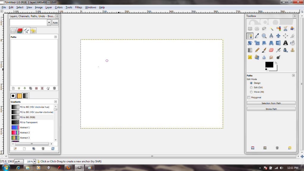
First things first, I need to select the Path tool from the Toolbox. It's the one that features the tip of a fountain pen. When I left-click it on my canvas, a dot appears; this is the first anchor point.


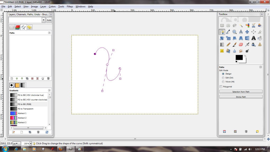
By clicking again and again, I make a path. The active dot--that is, the one I'm manipulating at any given moment--is clear with a purple outline, while the quiescent dots are solid purple.


I can manipulate the lines that comprise the path. Either by grasping them and stretching or by using the 'handles' at the anchors, it's possible to create any curve imaginable.


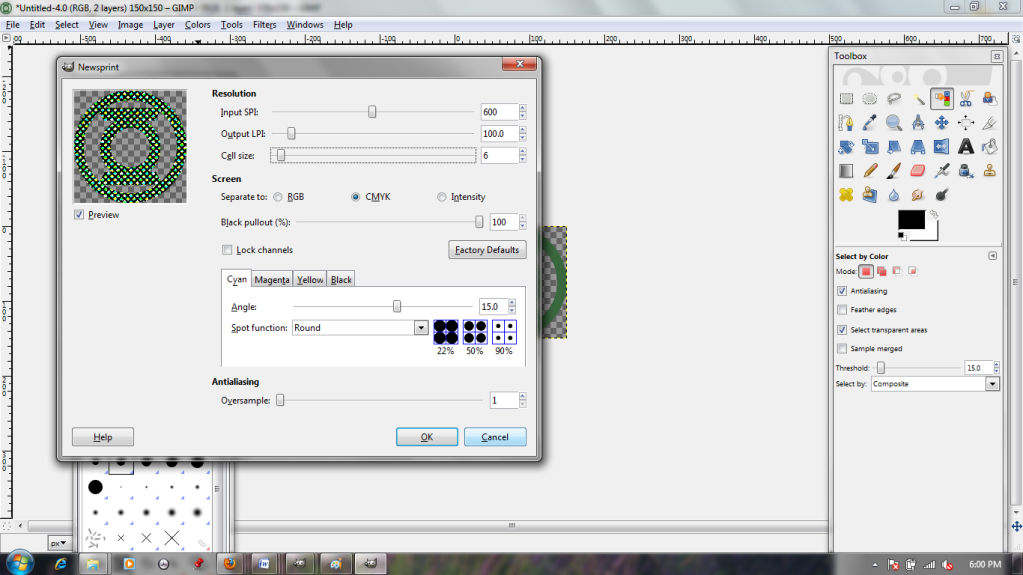
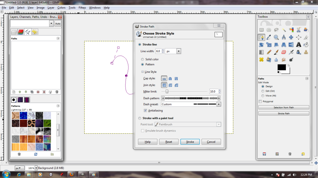
Now, the path is well and good, but I want to add effects to it. We'll do this by "stroking." I access the stroke dialogue through the menu that pops up after I right-click on the image.


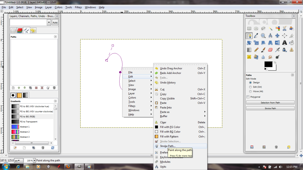
The dialogue is pretty simple; solid or pattern, various paintbrush effects, options to make the resulting line dotted. I'll go with the default, just to see what that gets me.


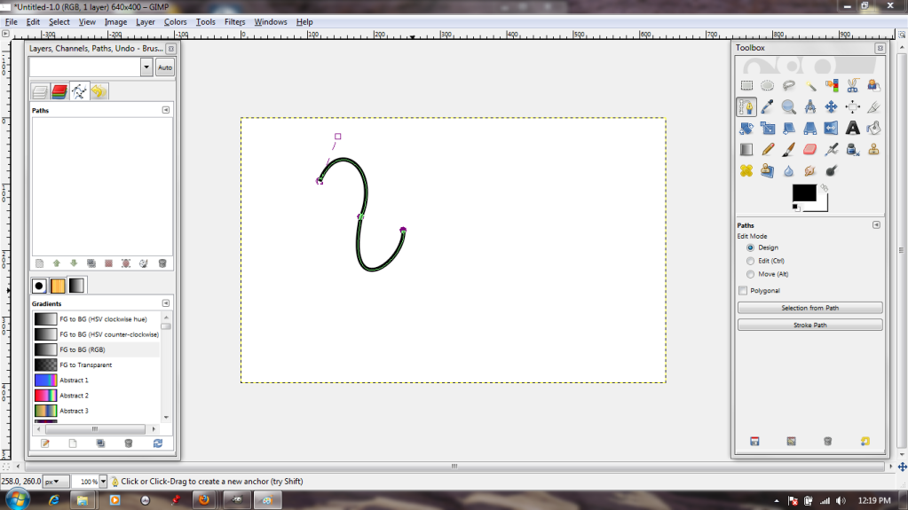
...A big, thick, plain line in the selected foreground color. Not exactly exciting, so I Undo.


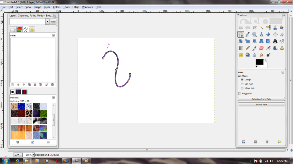
Back in the dialogue box, I choose to stroke it with a pattern; in this case, a pretty blue one. I also choose a frequency for breaks in my line, so that it will be dotted.


 That's a bit more interesting!


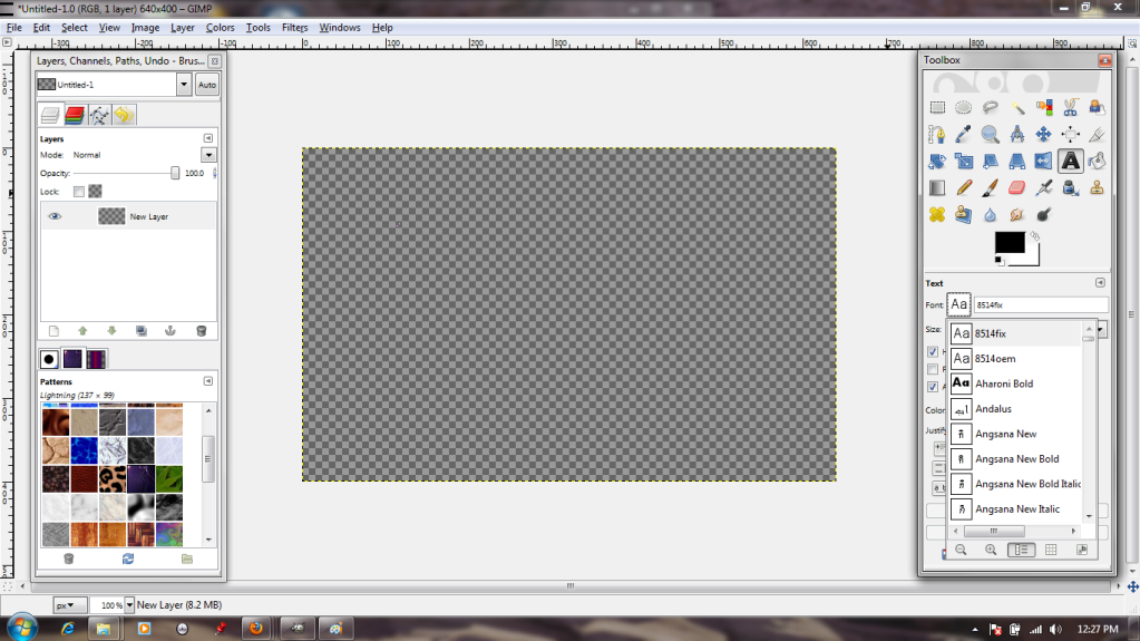
 But suppose I want to add that kind of effect to text?
Well, to start with, I will need to choose the Text tool and a font.


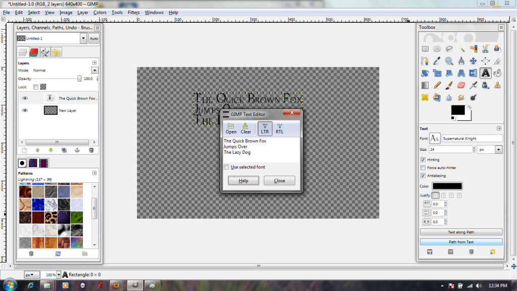
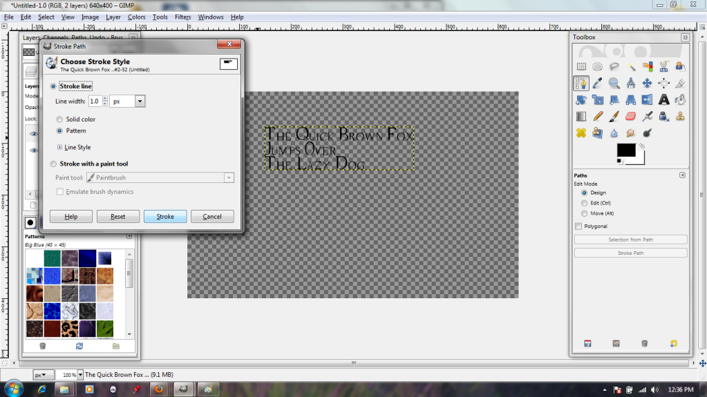
The typing dialogue box is pretty standard, if somewhat lacking in alignment options. Oh well. I put in a bit of filler text anyway, then click on the "Path From Text" button (highlighted in blue) to make the text itself into a shiny new path.


Back in the stroke dialogue, I specify that it should stroke it quite narrowly (1 pixel). This is because the font is quite fine-lined, and it could easily become illegible if it were stroked thickly.


And here we are; pretty, ripply blue text.


There will be more on paths next week!

Friday, March 2, 2012

Let's Try GIMP! Lesson 4: I Use Filters Now. Filters are COOL.

Another day, another insignia. I had to do the same color-select/paste thing with this as I did with the last one; in the interests of saving space, we'll skip right to the point where I paste it in as a new layer in a new file. You know the drill.


Looks a bit...drab, doesn't it? :( Ah, well. This is getting tough. I want to do something really cool, but my ambitions have outpaced my skills. If only there were some sort of tools that automatically create sophisticated effects...


Ooh, filters! "Supernova" sounds fancy!


Ew. Well, that's...less than ideal. It would probably be pretty useful if I wanted to make something look shiny, though. Good thing the preview window lets me have a sneak peek! I'm just going to hit cancel right now, though. I mean, it could be a lot worse; I could have...


Lens flare!? No, I don't want this to look like an Abrams movie (although the dialogue does allow me to move the "light" around with my cursor, which is interesting). Cancel!


Maybe I should carry on with my comic book theme. The Newsprint filter looks interesting, and the sliders let me adjust the dot size up and down, but it's a bit gritty for my taste.


"Edge Detect" sounds as though it sharpens images, and the "Neon" option is interesting. The shiny edge makes it look quite 3-D. It's a bit dark, though, regardless of the name.


The most interesting options by far are in the "Alpha to Logo" section; I think I'll continue with my neon theme by choosing "Alien Neon." It lets me choose a color and a number of bands.


Wow! This filter actually rendered a new background layer in black AND a pre-masked layer in bright green! Best of all, my original is still there (invisible up top) in case I should change my mind.


But on second thought, I don't like the bright green. "Colorize" will fix that.


The sliders in the dialogue box let me toy with the layer's color. I can go from pink...


...to yellow in just a few clicks!

Filters can be really helpful for getting an effect that you can't do by yourself.