Saturday, February 25, 2012

Let's Try GIMP! Lesson 3: Opening AI Files, Copy/Pasting as Layer, Clone Tool, and Warping Images

Oof. I had to work on Friday night, and so this blog update is late. To make up for it, I've gone extra-long and tried out several tools and techniques.

Because last week's escapade with Iron Man went so well, I've decided I'd like to mess with Captain America next. I'm going to be adding a new insignia to him. I found a lovely vector graphic made by someone online, and it is exactly what I need.


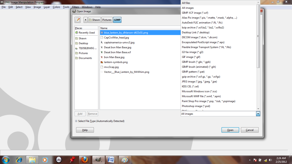
Unfortunately, they made it in Adobe Illustrator, and GIMP doesn't like .ai files. I can't even see it in the "open" dialogue. :-(
But if I change the setting from "All Images" to "All Files"...


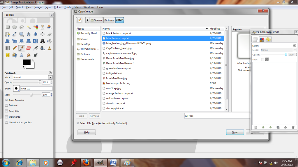
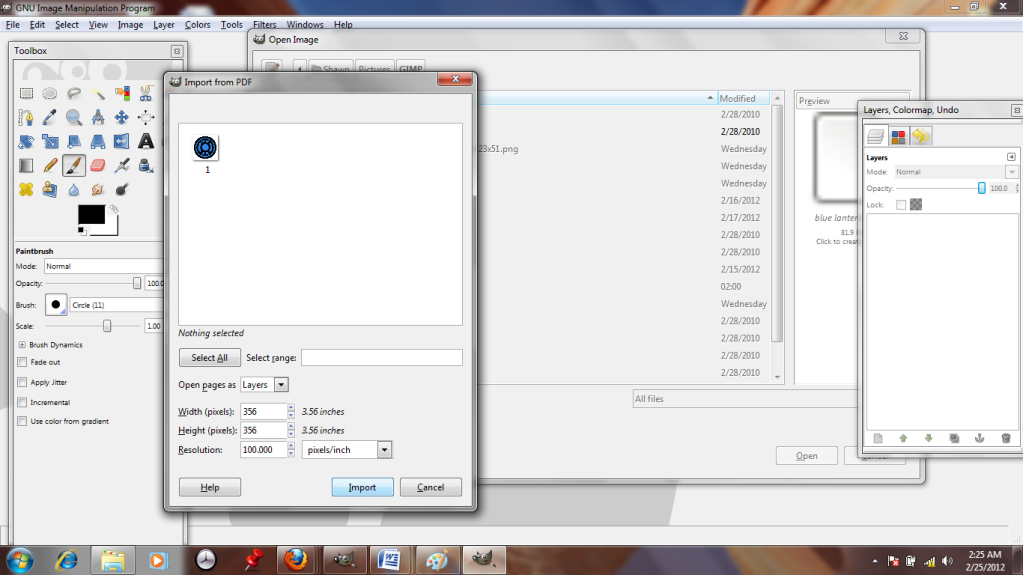
It suddenly appears. GIMP can read it like a .pdf, as long as I convert it. Hooray!


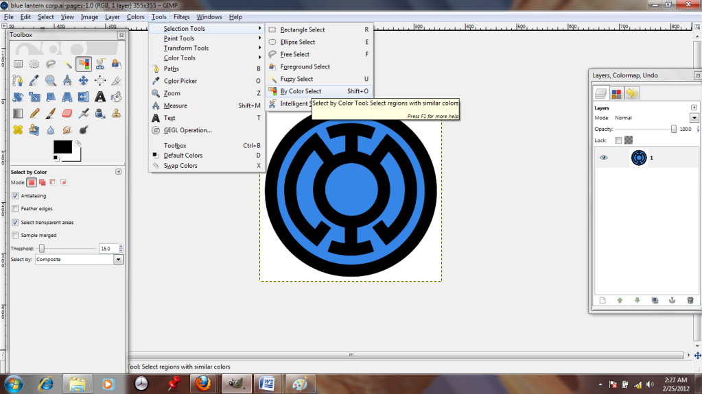
It's a nice image, but I don't want the whole thing, just the black parts, so I'm going to use the "color select" tool to pick those out. Just click it, then click the black regions.


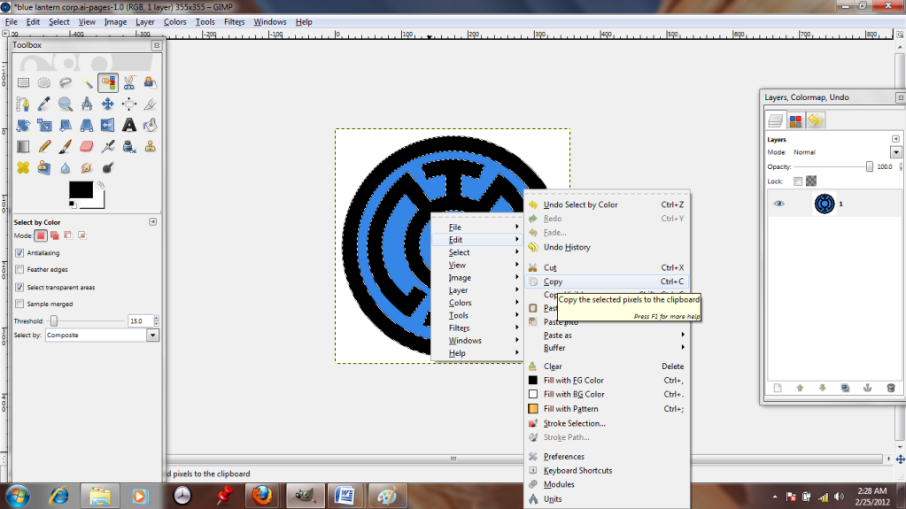
The selected regions are surrounded by white dotted lines. I right-click and copy the parts I want; they're now stored in my clipboard.


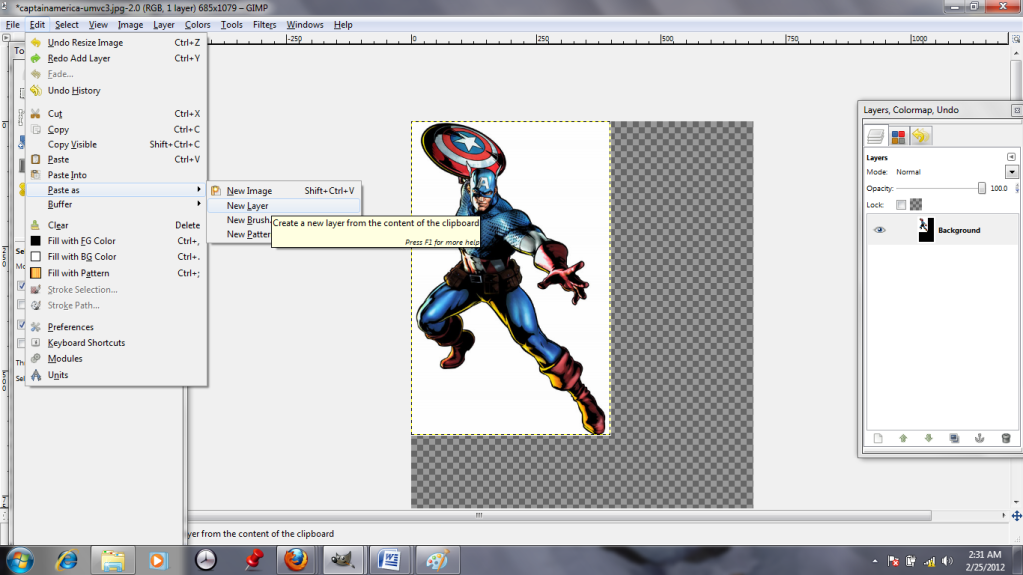
Captain America apparently took posing lessons from his good friend Iron Man, I notice! I'm going to paste the black outline in as a New Layer.
Pasting it as a new layer ensures that I can do whatever I want to the insignia without harming Cap, who is my background layer.


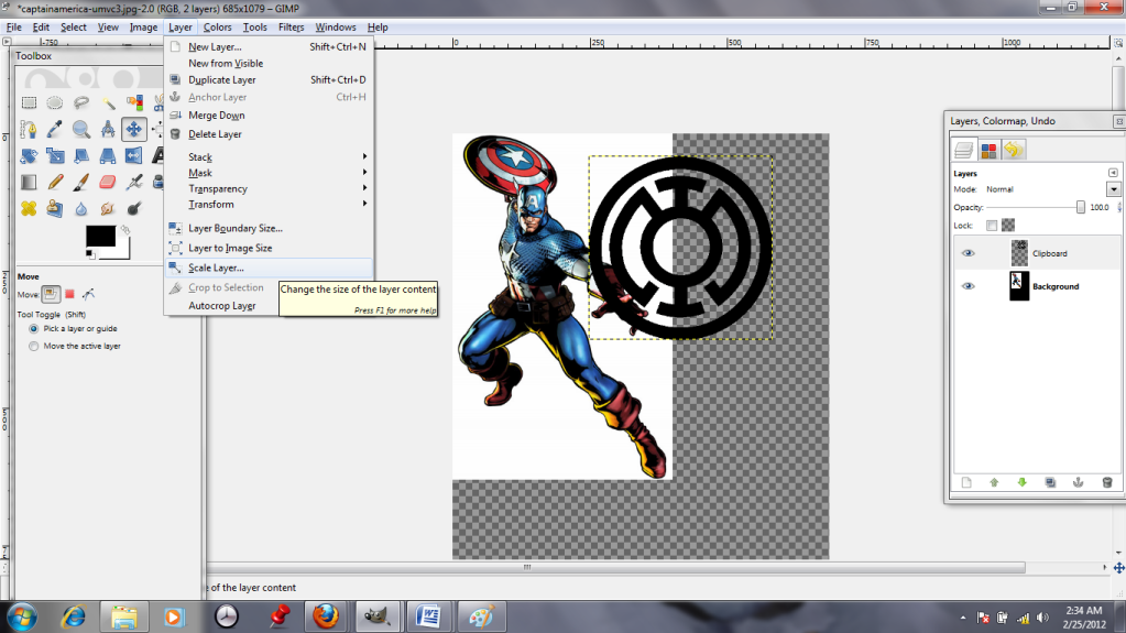
 It's pasted in, all right, but it's enormous! The "Scale Layer" tool lets me toggle the size up and down...


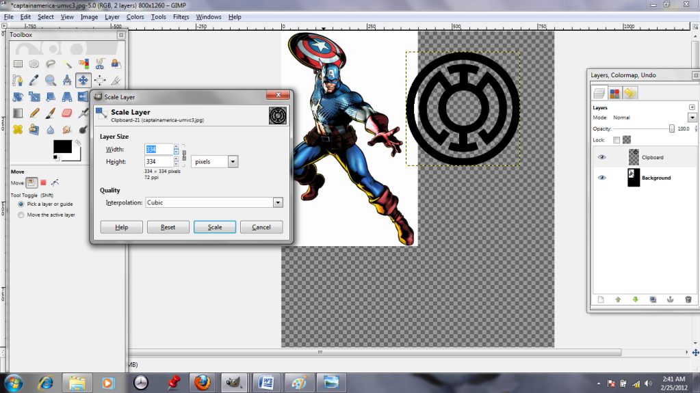
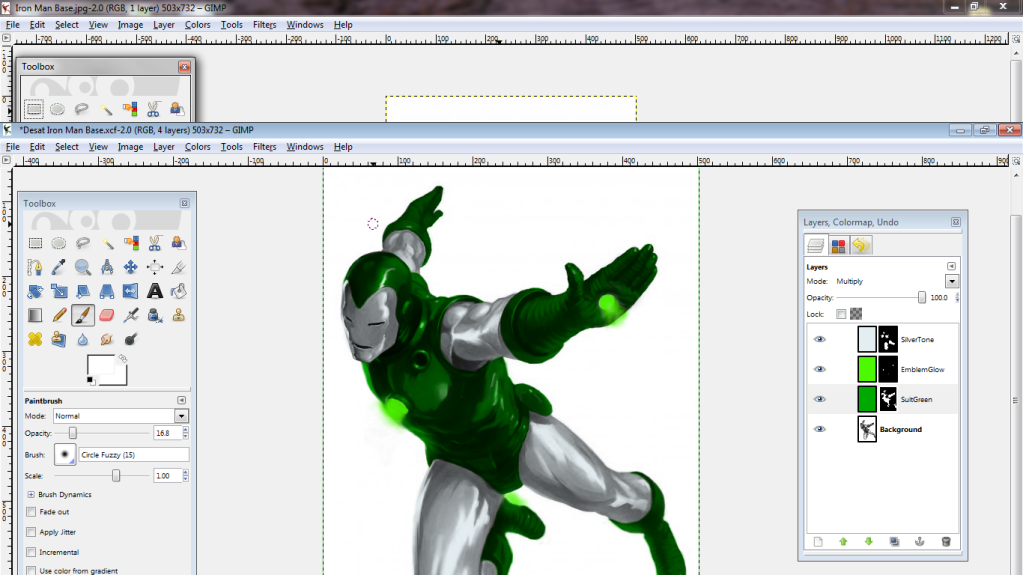
 ...I just play with it until it looks about right. (The insignia will also be orange from now on, for the sake of visibility.)


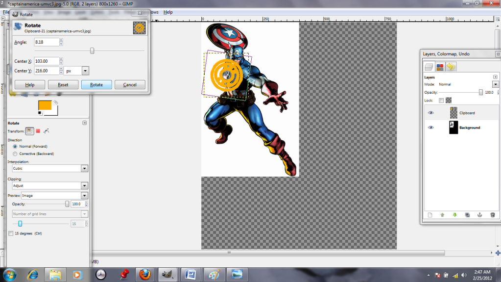
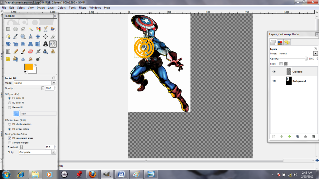
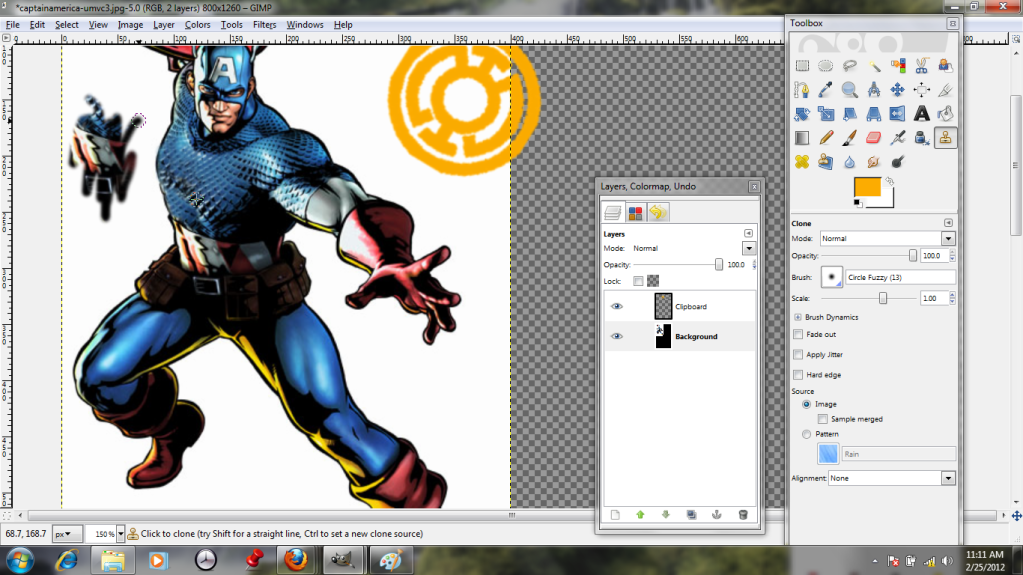
The "Rotate" tool, 3 down on the far left of the toolbox, allows me to twist the layer like I'm spinning a record. This is helpful, because Cap's chest is angled. I use his star as a guide to eyeball the appropriate tilt. Then I scoot that layer over and select the background; I need to do some cloning. Will humanity never learn from Reed Richards' mistakes!? (No, not that kind of cloning. I promise, no robot Thors.)


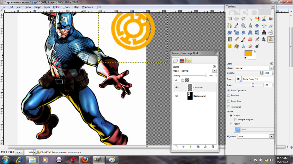
The "Clone" tool is pretty neat. It allows me to select one area (seen here with a red circle added,) and use that as a paintbrush. This way, I can hide Cap's star with cloned chain mail, as long as I am careful to pluck bits from regions that will reasonably match the light and shadow.


Here, we have his chest pretty much done; I've also added a scribble to dramatize what "Clone" really does.


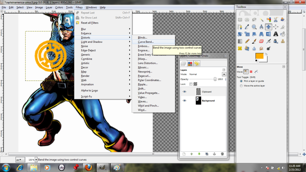
Unfortunately, tilting the insignia wasn't really enough to make it look like it conforms to the shape of his chest. It needs to curve and bend. Shockingly, the best tool for the job is the "Curve Bend" tool!


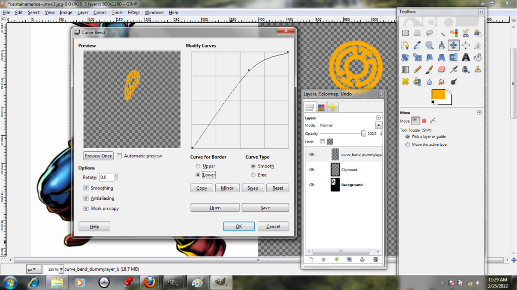
By playing with the curve in this dialogue, I can stretch and warp the layer like taffy until I get the shape I want. The preview allows me to see what I'm doing, and hopefully to avoid messing it up too much. I've also clicked the option to work with a copy, which means my original layer remains untouched.


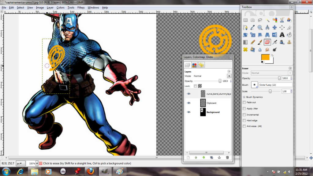
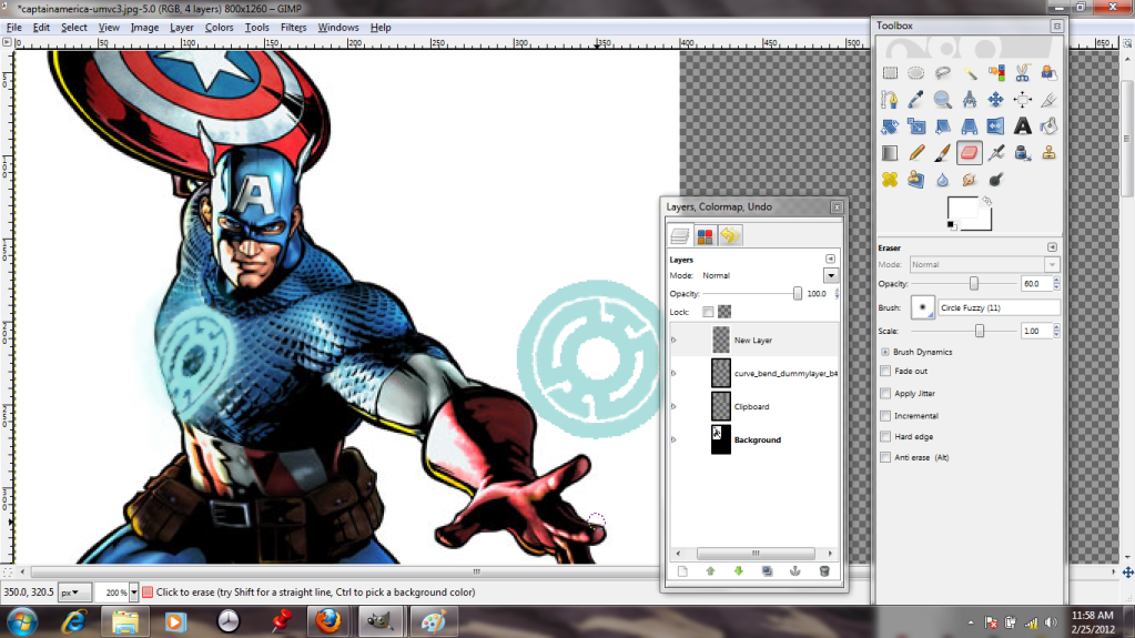
Et voila-- it looks more three-dimensional. I cheat and erase the bits that hang off his body, because "Curve Bend" can't extrapolate that there's a guy there and hide the bits that would be covered.


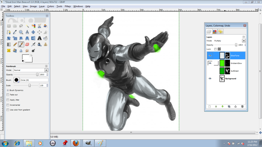
This is my correctly-colored version, with a bit of glow painted on to another new layer (the better to take it off later!)

Naturally, I save this as a GIMP file and exit.

Friday, February 17, 2012

Let's Try GIMP! Lesson 2: Recolor Using Layer Masks

As you may have guessed, I'm a bit of an Avengers geek (the fake text in the last post just might be a tipoff.) However, I absolutely can't resist messing with things I like, so tonight I've decided to RUIN Iron Man's traditional color scheme. Please, no tears.

Here is Iron Man, looking just as he should. Very subtle, guy.


Not for long, though! I don't want to just paint over him, because that would be annoying and I have no artistic talent. If I did, I could draw my own darn superheroes.
Instead, I'm going to desaturate him (turn the image black and white.) This option is located in the "Color" menu.


There are a few ways that GIMP can map the black and white; I choose to go with the Lightness option because it looks nice and sharp, and I don't want too much grey to interfere with the colors I put in later on.


I want to change the image by adding three new colors, so I'll be adding three new layers. I give them appropriate names so I can remember which I'm messing with.


Yeah, that dead black emptiness, like the uncaring void of space? That's not what I want to see. I switch all of the layers over to the "Multiply" setting.


I also click on the little eyeball icons so that I can work on one layer at a time.


 On "Multiply" the layers are kind of like sheets of colored cellophane laid over the image; they add color but are transparent. Obviously this doesn't help when they're black, but once I pick a bright green...


 I don't want the whole image to be green, so I apply a "Layer Mask" to each layer. This option is located 8 down in the "Layers" menu. I go with the Full Transparency option, which lets me choose exactly where I want the color to show up.


The layer mask is represented by the black box off to the right side of the layer icon (See below)
When using the layer mask, parts I paint with a "white" paintbrush show up, while parts I paint in "black" stay nice and invisible. I start out by using the bucket fill in black on the whole mask...


...and then paint in my chosen regions in "white."


Ooops! I went outside the lines!


Not to worry, though--I can just switch back to the black brush to fix it.


I repeat the process with each layer, getting it all juuuust right.
Finally, I use the eye icons to reveal each layer. Silvery-blue:


Glowing green... (This one involved a lot of playing around with brushes and opacity, so I could get those nice fuzzy areas. More on brushes later.)


And enamel green!

Perfect!
I save it as an .xcf file, which preserves the layers so I can play around with it more later. (Beware, Iron Lantern. I haven't finished with you yet!)
If I wanted to, say, print it out, I would save it as a .jpg or some other format which flattens the layers down.

Friday, February 10, 2012

Let's Try GIMP! Lesson 1

Hi! My name's Dorothy, and I'm trying to learn a little about GIMP, the free image manipulation program. To that end, I'll be making Windows tutorials as I blunder through. Here goes nothin'!

Sometimes when you start GIMP up, it takes a while (several minutes) to load the fonts. Don't worry, it isn't frozen. If you sit through it once, it should stop doing that.

Here's the loading screen, on top of my boring desktop. Maybe I need to create a more interesting one!


Once I've got it open, I need to open up a file to work on.


I've got something I want to tweak and send to a friend as a joke.


Hmm. I only want to send part of this image, not the whole thing. I'm going to click on the rectangle select over in the toolbox; maybe that will help.


Okay, now I have the part I want selected; it's got dotted lines around it. I right-click to see what my options are, and it looks like I'm in luck. Hovering over the "Image" tab features a "Crop to Selection tool. I click on it and cross my fingers.


Perfect! All the junk is gone! Now to save it.


Oh, what's this? I don't want to lose any quality, so I choose 100%.


There we go!