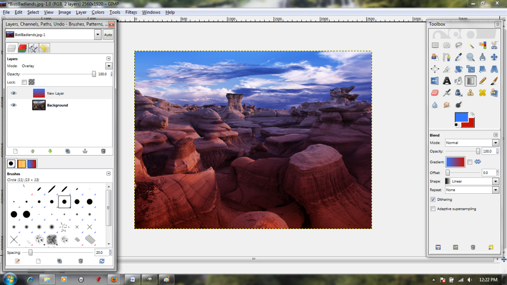
For example, I've found a lovely photo of some rock formations in New Mexico, but it's just...very blue. Terribly, terribly blue. I would prefer reddish, and to heck with realism.

So, not unlike a mad scientist, I set out to remake nature to my own specifications. The first step is (you guessed it!) creating a new layer.

I make it the same size as the photo, and transparent.
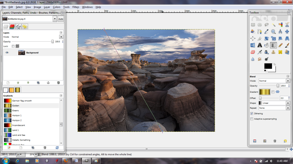
Next, I select the Gradient tool (Toolbox, fourth row down, third from the right). The control for the tool is a "stretchy" line; I left-click at the top of the screen, then again at the bottom. The line follows straight along. The second click turns on the gradient.

I know, I know--not helpful at all. But look what happens next:
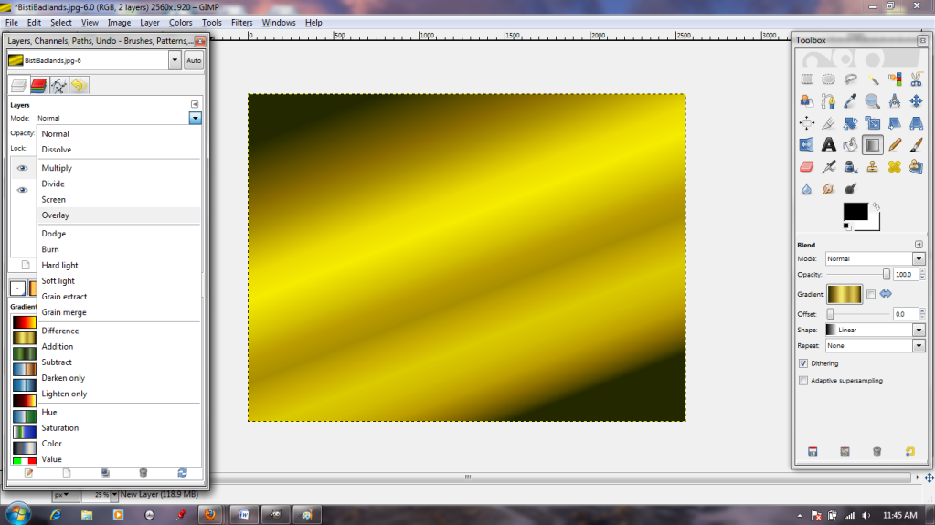
I switch the layer mode to Overlay.
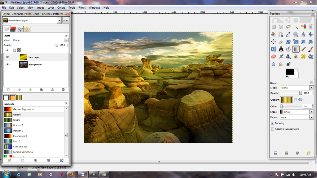
This makes it behave like a piece of transparent cellophane, with the colors printed on. Much better, but not the right color. I can choose another from the gradients in the Layers box.

Gradients appear differently depending on the way you move the mouse when applying them. Note that in this case, the start point is at the top of the image, and the end point at the bottom.

The line in this is simulated for easy understanding, but I've tried to make what happens obvious in this image: the part of the gradient displayed the farthest to the left is associated with the Start point (red stars & arrows), while the portion displayed to the right is associated with the End (green stars & arrows). The gradient displays perpendicular--NOT PARALLEL--to the stretchy line.

This is the same gradient, applied with a bottom-to-top movement.
Left-to right. You get the idea.

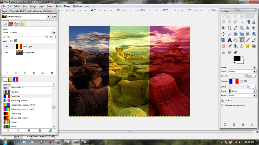
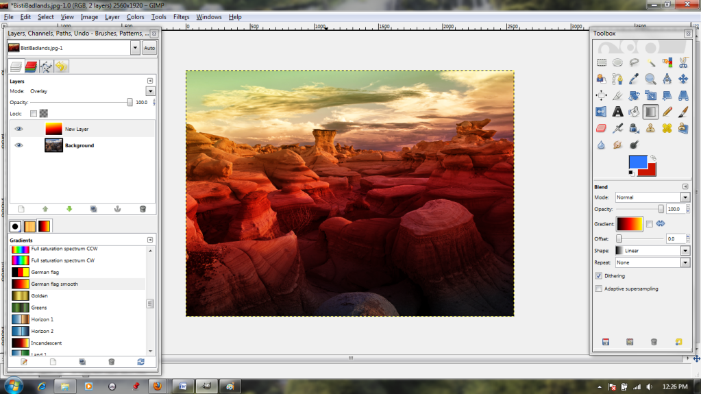
There are many premade gradients, but it's also possible to make your own; simply select the gradient called "foreground to background" and a pair of colors. In this case, I've chosen red and blue.
Apply top-to bottom, and I get this. Easy, right? Many of the premade gradients have more than two colors, and I eventually settled on one called "German Flag Smooth," because it reminded me of a desert dawn and looked a bit closer to natural:
dịch vụ quyết toán thuế
ReplyDeletekhoá học kế toán thuế
trung tâm kế toán
dịch vụ báo cáo thuế
dịch vụ kế toán nội bộ
dịch vụ dọn dẹp sổ sách kế toán
chung cư eco green city
kế toán cho giám đốc uynh đệ và Tiểu Phi Hiệp lập tức vây quanh
Đoạn Vân!
"Lão Đại, ngươi không có nghĩa khí, mấy món bảo bối tốt như vậy, ngươi
không cho chúng ta lấy một kiện, lại cung cúc cho cái tên dâm long đó!"
Đạt Nhĩ Ba nói vẻ hơi bất mãn. Còn hai con rồng còn lại chỉ lộ ra vẻ mặt
bất mãn !
"Cái gì ? Cái gì chứ? Các ngươi nói ta tặng cho Tạp Lỗ một cái rương pha
lên tỏa sáng lấp lánh đó hả?! Cái đó mà bảo bối gì chứ ! Chỉ là thủy
tinh bình thường có bỏ thêm chút bột ngân quang thôi, đúng là một lũ nhà
quê! Một lũ nhà quê chưa bao giờ lên thành phố!" Đoạn Vân vừa nghe lập
tức hiểu ngay. Nguyên lai Long Tộc trời sinh rất thích những món đồ
trong suốt sáng lấp lánh, còn mớ thủy tinh kia thì đương nhiên khỏi phải
bàn về độ trong suốt và sáng lấp lánh rồi ! Hơn nữa thủy tinh có pha
thêm bột ngân quang lại càng lấp lánh hơn nữa?
"Nhưng, ngươi lại kh
khoá học kế toán tổng hợp
tiếng anh cho người đi làm
khoá học kế toán excel
forum rao vat
mu private
Dịch vụ kế toán thuế, quyết toán thuế uy tín chuyên nghiệp nhất hiện nay
ReplyDeletetham khảo và click bên dưới
dịch vụ kế toán
dich vu ke toan
icid complex, the emerald
ReplyDelete